```{r, include = FALSE, echo=FALSE}
source("../setup.R")
```
```{r DT-options, include = FALSE}
toggle_select <- DT::JS(
"table.on('click.dt', 'tbody tr', function() {",
"$(this).toggleClass('selected');",
"})"
)
table_options <- function(scrollY, title, csv) {
list(
dom = "Bft",
pageLength = -1,
searching = TRUE,
scrollX = TRUE,
scrollY = scrollY,
buttons = list(
list(
extend = "copy",
filename = title
),
list(
extend = "csv",
filename = csv
)
)
)
}
```
## The world is full of obvious things which nobody by any chance observes {.transition-slide .center style="text-align: center;"}
[Quote from Arthur Conan Doyle, The Hound of the Baskervilles]{.smallest}
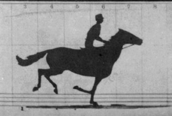
## The story of the galloping horse
Galloping horses throughout history were drawn with all four legs out.

|

|
| Baronet, 1794 | Derby D'Epsom 1821 |
[Read more in [Lankester: The Problem of the Galloping Horse](https://ejmuybridge.wordpress.com/2010/07/20/lankester-the-problem-of-the-galloping-horse/)]{.smallest}
## The story of the galloping horse
With the birth of photography, and particular motion photography, Muybridge was able to illustrate that [all four legs are never extended simultaneously]{.monash-blue2}.
:::: {.columns}
::: {.column}
 [Source: [wikimedia](https://upload.wikimedia.org/wikipedia/commons/0/07/The_Horse_in_Motion-anim.gif)]{.smallest}
:::
::: {.column}
::: {.fragment}
[Source: [wikimedia](https://upload.wikimedia.org/wikipedia/commons/0/07/The_Horse_in_Motion-anim.gif)]{.smallest}
:::
::: {.column}
::: {.fragment}
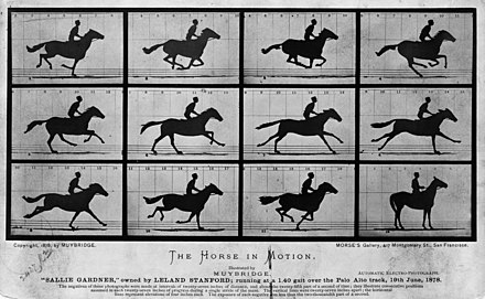 [Source: [wikimedia](https://upload.wikimedia.org/wikipedia/commons/thumb/d/d2/The_Horse_in_Motion_high_res.jpg/440px-The_Horse_in_Motion_high_res.jpg)]{.smallest}
:::
:::
::::
## An evolution in seeing the world [(1/3)]{.smallest}
::: {.panel-tabset}
## hills - beginner
[Source: [wikimedia](https://upload.wikimedia.org/wikipedia/commons/thumb/d/d2/The_Horse_in_Motion_high_res.jpg/440px-The_Horse_in_Motion_high_res.jpg)]{.smallest}
:::
:::
::::
## An evolution in seeing the world [(1/3)]{.smallest}
::: {.panel-tabset}
## hills - beginner

Mrs Robinson says *Hills are more interesting than that. Usually you can see valleys and shadows.*
## hills - terrible fix
so I put some shadows on.
 ## hills - what do you see
Mrs Robinson looks horrified!
*Go outside and take a look at the hills in the distance*
## hills - what do you see
Mrs Robinson looks horrified!
*Go outside and take a look at the hills in the distance*

 :::
## An evolution in seeing the world [(2/3)]{.smallest}
:::: {.columns}
::: {.column width="33%"}
Drawing lemons

:::
## An evolution in seeing the world [(2/3)]{.smallest}
:::: {.columns}
::: {.column width="33%"}
Drawing lemons

Is something is missing?
:::
::: {.column width="33%"}
::: {.fragment}
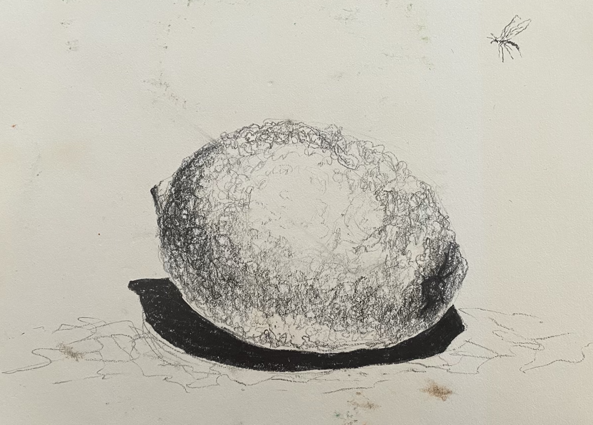
My sketch
:::
:::
::: {.column width=33%}
::: {.fragment}
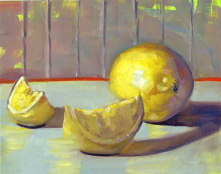
Notice the yellow reflection(s) and shine on the skin?
:::
:::
::::
## An evolution in seeing the world [(3/3)]{.smallest}
:::: {.columns}
::: {.column}
Drawing trees
{width=500}
Does it look like a tree? What is not realistic?
[Source: [https://toppng.com](https://toppng.com/free-image/large-green-tree-PNG-free-PNG-Images_47680#google_vignette)]{.smallest}
:::
::: {.column}
::: {.fragment}
Tree foliage has lots of different colours
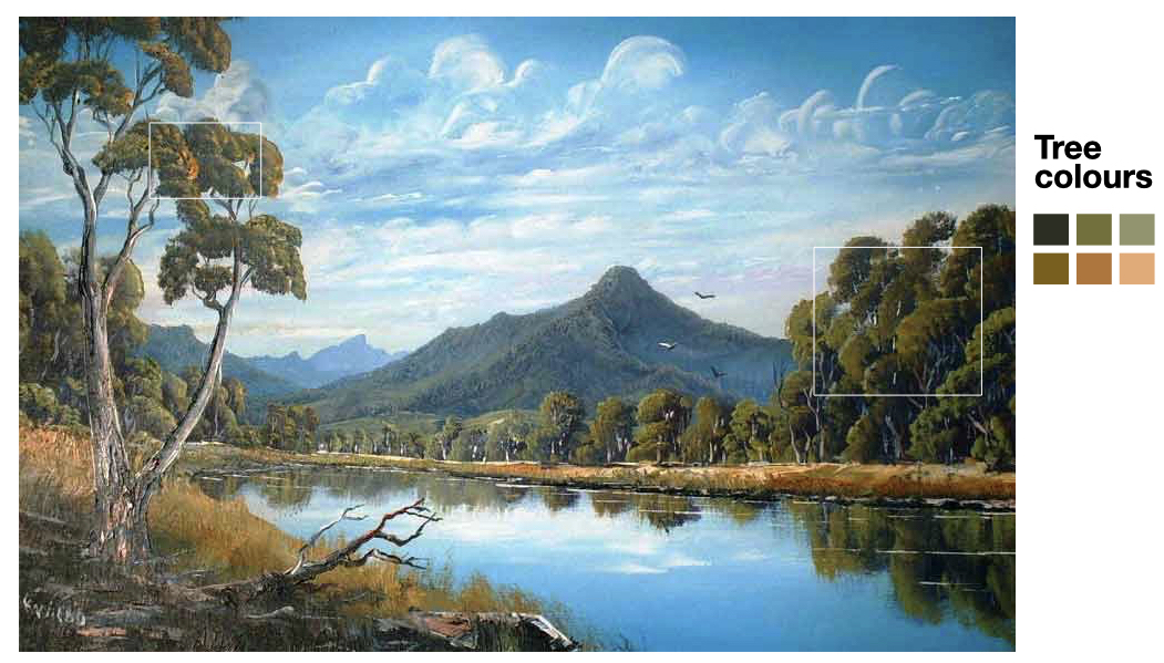
:::
:::
::::
## Philosophical reflection
You, me, we humans have a tendency to
- only see what other people have done or say,
- not what we can see,
- or impose beliefs, like trees are green.
When you look at data, you might discover that there is a different story, or many different stories.
## Try to see with fresh eyes {.transition-slide .center style="text-align: center;"}
## Outline
- The humble but powerful scatterplot
- Additions and variations
- Transformations to linearity
- (Robust) numerical measures of association
- Simpson's paradox
- Making null samples to test for association
- Imputing missings
## The scatterplot
::: {.info}
Scatterplots are the natural plot to make to explore [association]{.monash-orange2} between two [**continuous** (quantitative or numeric) variables]{.monash-orange2}.
:::
They are not just for [linear]{.monash-orange2} relationships but are useful for examining [nonlinear]{.monash-orange2} patterns, [clustering]{.monash-orange2} and [outliers]{.monash-orange2}.
We also can think about scatterplots in terms of statistical distributions: if a histogram shows a marginal distribution, a [scatterplot]{.monash-blue2} allows us to examine the [bivariate distribution]{.monash-blue2} of a sample.
## History
- Descartes provided the Cartesian coordinate system in the 17th century, with perpendicular lines indicating two axes.
::: {.fragment}
- It wasn't until [**1832**]{.monash-orange2} that the scatterplot appeared, when [John Frederick Herschel](http://www.datavis.ca/milestones/index.php?group=1800%2B) plotted position and time of double stars.
:::
::: {.fragment}
- This is 200 years after the Cartesian coordinate system, and [50 years after bar charts and line charts](http://www.datavis.ca/milestones/index.php?group=1700s) appeared, used in the work of William Playfair to examine economic data.
:::
::: {.fragment}
- Kopf argues that *[The scatter plot]{.monash-blue2}, by contrast, proved more useful for scientists*, but it clearly is useful for [economics]{.monash-blue2} today.
:::
[http://www.datavis.ca/milestones/]{.smallest}
## Language and terminology
Are the words "correlation" and "association" interchangeable?
> In the broadest sense **correlation** is any statistical association, though it commonly refers to the degree to which a pair of variables are **linearly** related. [[Wikipedia](https://en.wikipedia.org/wiki/Correlation_and_dependence)]{.smallest}
::: {.info}
If the relationship is not linear, call it [association]{.monash-orange2}, and avoid correlated.
:::
## Features of a pair of continuous variables [(1/3)]{.smallest}
```{r}
#| label: scatterplots
#| echo: false
#| eval: false
#| fig-width: 2
#| fig-height: 2
set.seed(55555)
d_trend <- tibble(x = runif(100) - 0.5) |>
mutate(
positive = 4 * x + rnorm(100) * 0.5,
none = rnorm(100) * 0.5,
negative = -4 * x + rnorm(100) * 0.5
) |>
pivot_longer(cols = positive:negative, names_to = "trend", values_to = "y") |>
mutate(trend = factor(trend,
levels = c("positive", "none", "negative")
)) |>
select(trend, x, y)
d_trend |>
filter(trend == "positive") |>
ggplot(aes(x = x, y = y)) +
geom_point() +
theme_void() +
theme(
aspect.ratio = 1,
axis.line.x = element_line(color = "black", size = 2),
axis.line.y = element_line(color = "black", size = 2)
)
d_trend |>
filter(trend == "negative") |>
ggplot(aes(x = x, y = y)) +
geom_point() +
theme_void() +
theme(
aspect.ratio = 1,
axis.line.x = element_line(color = "black", size = 2),
axis.line.y = element_line(color = "black", size = 2)
)
d_trend |>
filter(trend == "none") |>
ggplot(aes(x = x, y = y)) +
geom_point() +
theme_void() +
theme(
aspect.ratio = 1,
axis.line.x = element_line(color = "black", size = 2),
axis.line.y = element_line(color = "black", size = 2)
)
d_strength <- tibble(x = runif(100) - 0.5) |>
mutate(
strong = 4 * x + rnorm(100) * 0.5,
moderate = 4 * x + rnorm(100),
weak = -4 * x + rnorm(100) * 3
) |>
pivot_longer(
cols = strong:weak,
names_to = "strength", values_to = "y"
) |>
mutate(strength = factor(strength,
levels = c("strong", "moderate", "weak")
)) |>
select(strength, x, y)
d_strength |>
filter(strength == "strong") |>
ggplot(aes(x = x, y = y)) +
geom_point() +
theme_void() +
theme(
aspect.ratio = 1,
axis.line.x = element_line(color = "black", size = 2),
axis.line.y = element_line(color = "black", size = 2)
)
d_strength |>
filter(strength == "moderate") |>
ggplot(aes(x = x, y = y)) +
geom_point() +
theme_void() +
theme(
aspect.ratio = 1,
axis.line.x = element_line(color = "black", size = 2),
axis.line.y = element_line(color = "black", size = 2)
)
d_strength |>
filter(strength == "weak") |>
ggplot(aes(x = x, y = y)) +
geom_point() +
theme_void() +
theme(
aspect.ratio = 1,
axis.line.x = element_line(color = "black", size = 2),
axis.line.y = element_line(color = "black", size = 2)
)
```
```{r}
#| label: feature-table
#| echo: false
tribble(
~Feature, ~Example, ~Description,
"positive trend", "", "Low value corresponds to low value, and high to high.",
"negative trend", "", "Low value corresponds to high value, and high to low.",
"no trend", "", "No relationship",
"strong", "", "Very little variation around the trend",
"moderate", "", "Variation around the trend is almost as much as the trend",
"weak", "", "A lot of variation making it hard to see any trend"
) |>
knitr::kable(escape = FALSE) |>
kableExtra::kable_classic() |>
kableExtra::kable_styling(font_size=30,
full_width=FALSE) |>
kableExtra::column_spec(2,
image=spec_image(
c("../images/scatterplots-1.png",
"../images/scatterplots-2.png",
"../images/scatterplots-3.png",
"../images/scatterplots-4.png",
"../images/scatterplots-5.png",
"../images/scatterplots-6.png"), width=250, height=200))
```
## Features of a pair of continuous variables [(2/3)]{.smallest}
```{r}
#| label: scatterplots2
#| echo: false
#| eval: false
#| include: false
#| fig-width: 2
#| fig-height: 2
d_form <- tibble(x = runif(100) - 0.5) |>
mutate(
linear = 4 * x + rnorm(100) * 0.5,
nonlinear1 = 12 * x^2 + rnorm(100) * 0.5,
nonlinear2 = 2 * x - 5 * x^2 + rnorm(100) * 0.1
) |>
pivot_longer(
cols = linear:nonlinear2, names_to = "form",
values_to = "y"
) |>
select(form, x, y)
d_form |>
filter(form == "linear") |>
ggplot(aes(x = x, y = y)) +
geom_point() +
theme_void() +
theme(
aspect.ratio = 1,
axis.line.x = element_line(color = "black", size = 2),
axis.line.y = element_line(color = "black", size = 2)
)
d_form |>
filter(form == "nonlinear1") |>
ggplot(aes(x = x, y = y)) +
geom_point() +
theme_void() +
theme(
aspect.ratio = 1,
axis.line.x = element_line(color = "black", size = 2),
axis.line.y = element_line(color = "black", size = 2)
)
d_form |>
filter(form == "nonlinear2") |>
ggplot(aes(x = x, y = y)) +
geom_point() +
theme_void() +
theme(
aspect.ratio = 1,
axis.line.x = element_line(color = "black", size = 2),
axis.line.y = element_line(color = "black", size = 2)
)
d_outliers <- tibble(x = runif(100) - 0.5) |>
mutate(y = 4 * x + rnorm(100) * 0.5)
d_outliers <- d_outliers |>
bind_rows(tibble(x = runif(5) / 10 - 0.45, y = 2 + rnorm(5) * 0.5))
d_outliers |>
ggplot(aes(x = x, y = y)) +
geom_point() +
theme_void() +
theme(
aspect.ratio = 1,
axis.line.x = element_line(color = "black", size = 2),
axis.line.y = element_line(color = "black", size = 2)
)
d_clusters <- tibble(x = c(
rnorm(50) / 6 - 0.5,
rnorm(50) / 6,
rnorm(50) / 6 + 0.5
)) |>
mutate(y = c(
rnorm(50) / 6,
rnorm(50) / 6 + 1, rnorm(50) / 6
))
d_clusters |>
ggplot(aes(x = x, y = y)) +
geom_point() +
theme_void() +
theme(
aspect.ratio = 1,
axis.line.x = element_line(color = "black", size = 2),
axis.line.y = element_line(color = "black", size = 2)
)
d_gaps <- tibble(x = runif(150)) |>
mutate(y = runif(150))
d_gaps <- d_gaps |>
filter(!(between(x + 2 * y, 1.2, 1.6)))
d_gaps |>
ggplot(aes(x = x, y = y)) +
geom_polygon(
data = tibble(x = c(0, 1, 1, 0), y = c(1.2 / 2, 0.2 / 2, 0.6 / 2, 1.6 / 2)),
fill = "red", alpha = 0.3
) +
geom_point() +
theme_void() +
theme(
aspect.ratio = 1,
axis.line.x = element_line(color = "black", size = 2),
axis.line.y = element_line(color = "black", size = 2)
)
```
```{r}
#| label: feature-table2
#| echo: false
tribble(
~Feature, ~Example, ~Description,
"linear form", "", "The shape is linear",
"nonlinear form", "", "The shape is more of a curve",
"nonlinear form", "", "The shape is more of a curve",
"outliers", "", "There are one or more points that do not fit the pattern on the others",
"clusters", "", "The observations group into multiple clumps",
"gaps", "", "There is a gap, or gaps, but its not clumped"
) |>
knitr::kable(escape = FALSE) |>
kableExtra::kable_classic() |>
kableExtra::kable_styling(font_size=30,
full_width=FALSE) |>
kableExtra::column_spec(2,
image=spec_image(
c("../images/scatterplots2-1.png",
"../images/scatterplots2-2.png",
"../images/scatterplots2-3.png",
"../images/scatterplots2-4.png",
"../images/scatterplots2-5.png",
"../images/scatterplots2-6.png"), width=250, height=200))
```
## Features of a pair of continuous variables [(3/3)]{.smallest}
```{r}
#| label: scatterplots3
#| echo: false
#| include: false
#| fig-width: 2
#| fig-height: 2
d_barrier <- tibble(x = runif(200)) |>
mutate(y = runif(200))
d_barrier <- d_barrier |>
filter(-x + 3 * y < 1.2)
d_barrier |>
ggplot(aes(x = x, y = y)) +
geom_polygon(
data = tibble(x = c(0, 1, 1, 0), y = c(1.2 / 3, 2.2 / 3, 1, 1)),
fill = "red", alpha = 0.3
) +
geom_point() +
theme_void() +
theme(
aspect.ratio = 1,
axis.line.x = element_line(color = "black", size = 2),
axis.line.y = element_line(color = "black", size = 2)
)
l_shape <- tibble(
x = c(rexp(50, 0.01), runif(50) * 20),
y = c(runif(50) * 20, rexp(50, 0.01))
)
l_shape |>
ggplot(aes(x = x, y = y)) +
geom_point() +
theme_void() +
theme(
aspect.ratio = 1,
axis.line.x = element_line(color = "black", size = 2),
axis.line.y = element_line(color = "black", size = 2)
)
discrete <- tibble(x = rnorm(200)) |>
mutate(y = -x + rnorm(25) * 0.1 + rep(0:7, 25)) |>
filter((scale(x)^2 + scale(y)^2) < 2)
discrete |>
ggplot(aes(x = x, y = y)) +
geom_point() +
theme_void() +
theme(
aspect.ratio = 1,
axis.line.x = element_line(color = "black", size = 2),
axis.line.y = element_line(color = "black", size = 2)
)
hetero <- tibble(x = runif(200) - 0.5) |>
mutate(y = -2 * x + rnorm(200) * (x + 0.5))
hetero |>
ggplot(aes(x = x, y = y)) +
geom_point() +
theme_void() +
theme(
aspect.ratio = 1,
axis.line.x = element_line(color = "black", size = 2),
axis.line.y = element_line(color = "black", size = 2)
)
weighted <- tibble(x = runif(50) - 0.5) |>
mutate(
y = -2 * x + rnorm(50) * 0.8,
w = runif(50) * (x + 0.5)
)
weighted |>
ggplot(aes(x = x, y = y, size = w + 0.1)) +
geom_point(alpha = 0.7) +
scale_size_area(max_size = 6) +
theme_void() +
theme(
aspect.ratio = 1, legend.position = "none",
axis.line.x = element_line(color = "black", size = 2),
axis.line.y = element_line(color = "black", size = 2)
)
```
```{r}
#| label: feature-table3
#| echo: false
tribble(
~Feature, ~Example, ~Description,
"barrier", "", "There is combination of the variables which appears impossible",
"l-shape", "", "When one variable changes the other is approximately constant",
"discreteness", "", "Relationship between two variables is different from the overall, and observations are in a striped pattern",
"heteroskedastic", "", "Variation is different in different areas, maybe depends on value of x variable",
"weighted", "", "If observations have an associated weight, reflect in scatterplot, e.g. bubble chart"
) |>
knitr::kable(escape = FALSE) |>
kableExtra::kable_classic() |>
kableExtra::kable_styling(font_size=30,
full_width=FALSE) |>
kableExtra::column_spec(2,
image=spec_image(
c("../images/scatterplots3-1.png",
"../images/scatterplots3-2.png",
"../images/scatterplots3-3.png",
"../images/scatterplots3-4.png",
"../images/scatterplots3-5.png"), width=250, height=200))
```
## Additional considerations (Unwin, 2015):
- **causation**: one variable has a direct influence on the other variable, in some way. For example, people who are taller tend to weigh more. The dependent variable is conventionally on the y axis. *It's not generally possible to tell from the plot that the relationship is causal, which typically needs to be argued from other sources of information.*
- **association**: variables may be related to one another, but through a different variable, eg ice cream sales are positively correlated with beach drownings, is most likely a temperature relationship.
- **conditional relationships**: the relationship between variables is conditionally dependent on another, such as income against age likely has a different relationship depending on retired or not.
## Famous data examples {.transition-slide .center style="text-align: center;"}
## Famous scatterplot examples
:::: {.columns}
::: {.column style="font-size: 60%;"}
**Anscombe's quartet**
```{r}
#| label: anscombe
#| echo: false
#| fig-width: 6
#| fig-height: 2
#| out-width: 100%
anscombe_tidy <- anscombe |>
pivot_longer(cols = x1:y4, names_to = "var", values_to = "value") |>
mutate(
group = substr(var, 2, 2),
var = substr(var, 1, 1),
id = rep(1:11, rep(8, 11))
) |>
pivot_wider(
id_cols = c(id, group), names_from = var,
values_from = value
)
anscombe_tidy |>
ggplot(aes(x = x, y = y)) +
geom_point(colour = "orange", size = 3) +
facet_wrap(~group, ncol = 4, scales = "free") +
theme(
axis.text.x = element_blank(),
axis.text.y = element_blank()
)
```
All four sets of Anscombe has [same means, standard deviations and correlations]{.monash-blue2}, $\bar{x}$ = `r mean(anscombe$x1)`, $\bar{y}$ = `r round(mean(anscombe$y1),1)`, $s_x$ = `r round(sd(anscombe$x1),1)`,
$s_y$ = `r round(sd(anscombe$y1),1)`, $r$ = `r round(cor(anscombe$x1, anscombe$y1), 2)`.
::: {.info}
Numerical statistics are the same, for very different association.
:::
::: {.fragment}
**Datasaurus dozen**
And similarly all 13 sets of the datasaurus dozen have [same means, standard deviations and correlations]{.monash-blue2}, $\bar{x}$ = `r d <- datasaurus_dozen_wide; round(mean(d$dino_x),0)`, $\bar{y}$ = `r round(mean(d$dino_y),0)`, $s_x$ = `r round(sd(d$dino_x),0)`,
$s_y$ = `r round(sd(d$dino_y),0)`, $r$ = `r round(cor(d$dino_x, d$dino_y),2)`.
:::
:::
::: {.column style="font-size: 70%;"}
::: {.fragment}
```{r}
#| label: dinosaur
#| echo: false
#| out-width: 30%
#| fig-width: 3
#| fig-height: 2.8
datasaurus_dozen |>
filter(dataset == "dino") |>
ggplot(aes(x = x, y = y)) +
geom_point() +
theme(
axis.text.x = element_blank(),
axis.text.y = element_blank()
)
```
```{r}
#| label: datasaurus
#| echo: false
#| fig-height: 7
#| fig-width: 7
#| out-width: 60%
datasaurus_dozen |>
filter(dataset != "dino") |>
ggplot(aes(x = x, y = y)) +
geom_point() +
facet_wrap(~dataset, ncol = 4) +
theme(
axis.text.x = element_blank(),
axis.text.y = element_blank()
)
```
:::
:::
::::
## Scatterplot case studies {.transition-slide .center style="text-align: center;"}
## Case study: Olympics
```{r}
#| label: 2012-olympics
#| echo: false
data(oly12, package = "VGAMdata")
```
::: {.panel-tabset}
## 🖼
:::: {.columns}
::: {.column}
```{r}
#| label: 2012-olympics-plot1
#| echo: false
#| fig-width: 6.4
ggplot(oly12, aes(x = Height, y = Weight, label = Sport)) +
geom_point()
```
:::
::: {.column style="font-size:80%;"}
* Note: `Warning message: Removed 1346 rows containing missing values (geom_point)`
* Features:
- linear relationship (expected, more than?)
- outliers
- discretization
* Substantial overplotting, >10000 athletes.
* What is interesting? Are there some sport(s) where you would expect specific relationships?
:::
::::
## data
::: {.vscroll style="font-size:60%;"}
```{r}
skimr::skim(oly12)
```
:::
## R
```{r}
#| label: 2012-olympics-plot1
#| echo: true
#| eval: false
```
:::
## 🧩 Try this
::: {.info}
Interactivity can be a useful tool for exploring relationships.
:::
[Cut and paste the code]{.monash-blue2} into your R console, and the resulting plot to examine the sport of the athlete.
```{r}
#| eval: false
#| echo: true
library(tidyverse)
library(plotly)
data(oly12, package = "VGAMdata")
p <- ggplot(oly12, aes(x = Height, y = Weight, label = Sport)) +
geom_point()
ggplotly(p)
```
## How many athletes in the different sports?
:::: {.columns}
::: {.column width=70%}
::: {style="font-size: 70%;"}
```{r oly_smry}
#| echo: false
oly12 |>
count(Sport, sort = TRUE) |>
DT::datatable(
rownames = FALSE,
escape = FALSE,
width = "900px",
options = table_options(
scrollY = "500px",
title = "",
csv = "oly12"
),
callback = toggle_select
)
```
:::
:::
::: {.column width=30%}
Categories need re-working:
- so many different events grouped into athletics
- cycling split among many categories
:::
::::
## Consolidate factor levels
There are several cycling events that are reasonable to combine into one category. Similarly for gymnastics and athletics.
```{r oly_cat, echo=TRUE}
oly12 <- oly12 |>
mutate(Sport = as.character(Sport)) |>
mutate(Sport = ifelse(grepl("Cycling", Sport),
"Cycling", Sport
)) |>
mutate(Sport = ifelse(grepl("Gymnastics", Sport),
"Gymnastics", Sport
)) |>
mutate(Sport = ifelse(grepl("Athletics", Sport),
"Athletics", Sport
)) |>
mutate(Sport = as.factor(Sport))
```
## Drill down the by sport
::: {.panel-tabset}
## 🖼
```{r}
#| label: oly_facet
#| out-width: 70%
#| fig-width: 12
#| fig-height: 7
#| echo: false
ggplot(oly12, aes(x = Height, y = Weight)) +
geom_point(alpha = 0.5) +
facet_wrap(~Sport, ncol = 8) +
theme(aspect.ratio = 1)
```
## learn
:::: {.columns}
::: {.column style="font-size: 80%;"}
What is interesting?
::: {.fragment}
- Some sports have no data for height, weight
- The positive association between height and weight is visible across sports
- Nonlinear in wrestling?
- An outlier in judo, and football, and archery
- Maybe flatter among swimmers
- Taller in basketball, volleyball and handball
- Shorter in athletics, weightlifting and wrestling
- Little variance in tennis players
- [*There's a lot to digest*]{.monash-blue2}
:::
:::
::: {.column style="font-size: 80%;"}
::: {.fragment}
[Refine plots to make comparisons easier:]{.monash-blue2}
- Remove sports with missings
- Overlay model to assess linear relationships
- Drill down into other strata, eg male/female athletes
- Compare in small chunks, one group against the rest
:::
:::
::::
## R
```{r}
#| label: oly_facet
#| echo: true
#| eval: false
```
Note: alpha transparency, and aspect ratio
:::
## Remove missings, explore difference by sex
::: {.panel-tabset}
## 🖼️
```{r}
#| label: oly_women
#| out-width: 70%
#| fig-width: 12
#| fig-height: 7
#| echo: false
oly12 |>
filter(!(Sport %in% c("Boxing", "Gymnastics", "Synchronised Swimming", "Taekwondo", "Trampoline"))) |>
mutate(Sport = fct_drop(Sport)) |>
ggplot(aes(x = Height, y = Weight, colour = Sex)) +
geom_point(alpha = 0.5) +
facet_wrap(~Sport, ncol = 7, scales = "free") +
scale_colour_brewer("", palette = "Dark2") +
theme(aspect.ratio = 1, axis.text.x = element_text(angle = 90, vjust = 0.5, hjust = 1))
```
## learn
:::: {.columns}
::: {.column}
[Note: Because the focus is now on males vs females association shape within sport, make plots scale separately.]{.monash-orange2}
- Athletics category should have been broken into several more categories like track, field: a shot-putter has a very different physique to a sprinter.
- Generally, clustering of male/female athletes
:::
::: {.column}
- Outliers: a tall skinny male archer, a medium height very light female athletics athlete, tall light female weightlifter, tall light male volleyballer
- Canoe slalom athletes, divers, cyclists are tiny.
:::
::::
## R
```{r}
#| label: oly_women
#| echo: true
#| eval: false
```
:::
## Common ways to augment scatterplots
```{r}
#| label: generate_data
#| echo: false
set.seed(2222)
df <- tibble(x = c(rnorm(500) * 0.2, runif(300) + 1)) |>
mutate(
x2 = c(rnorm(500), runif(300) - 0.5),
y1 = c(
-2 * x[1:500] + rnorm(500),
3 * x[501:800] + rexp(300)
),
y2 = c(rep("A", 500), rep("B", 300)),
y3 = c(
-2 * (x2[1:500]) + rnorm(500) * 2,
2 * (x2[501:800]) + rnorm(300) * 0.5
)
)
```
```{r}
#| label: scatmodify
#| echo: false
#| eval: false
#| fig-width: 2
#| fig-height: 2
#| out-width: 100%
ggplot(df, aes(x = x2, y = y3)) +
geom_point() +
xlab("") +
ylab("") +
theme_void() +
theme(
aspect.ratio = 1,
axis.line.x = element_line(color = "black", size = 2),
axis.line.y = element_line(color = "black", size = 2)
)
ggplot(df, aes(x = x2, y = y3)) +
geom_point(alpha = 0.1) +
xlab("") +
ylab("") +
theme_void() +
theme(
aspect.ratio = 1,
axis.line.x = element_line(color = "black", size = 2),
axis.line.y = element_line(color = "black", size = 2)
)
ggplot(df, aes(x = x2, y = y3)) +
geom_smooth(colour = "purple", se = F, size = 2, span = 0.2) +
xlab("") +
ylab("") +
theme_void() +
theme(
aspect.ratio = 1,
axis.line.x = element_line(color = "black", size = 2),
axis.line.y = element_line(color = "black", size = 2)
)
ggplot(df, aes(x = x2, y = y3)) +
geom_point(alpha = 0.2) +
geom_smooth(colour = "purple", se = F, size = 2, span = 0.2) +
xlab("") +
ylab("") +
theme_void() +
theme(
aspect.ratio = 1,
axis.line.x = element_line(color = "black", size = 2),
axis.line.y = element_line(color = "black", size = 2)
)
ggplot(df, aes(x = x, y = y1)) +
geom_density_2d(colour = "black") +
xlab("") +
ylab("") +
theme_void() +
theme(
aspect.ratio = 1,
axis.line.x = element_line(color = "black", size = 2),
axis.line.y = element_line(color = "black", size = 2)
)
ggplot(df, aes(x = x, y = y1)) +
geom_density_2d_filled() +
xlab("") +
ylab("") +
theme_void() +
theme(
legend.position = "none", aspect.ratio = 1,
axis.line.x = element_line(color = "black", size = 2),
axis.line.y = element_line(color = "black", size = 2)
)
ggplot(df, aes(x = x, y = y1, colour = y2)) +
geom_point(alpha = 0.2) +
xlab("") +
ylab("") +
scale_colour_brewer("", palette = "Dark2") +
theme_void() +
theme(
legend.position = "none", aspect.ratio = 1,
axis.line.x = element_line(color = "black", size = 2),
axis.line.y = element_line(color = "black", size = 2)
)
ggplot(df, aes(x = x, y = y1, colour = y2)) +
geom_density2d() +
xlab("") +
ylab("") +
scale_colour_brewer("", palette = "Dark2") +
theme_void() +
theme(
legend.position = "none", aspect.ratio = 1,
axis.line.x = element_line(color = "black", size = 2),
axis.line.y = element_line(color = "black", size = 2)
)
```
```{r}
#| label: feature-table4
#| echo: false
tribble(
~Modification, ~Example, ~Purpose,
"alpha-blend", "", "alleviate overplotting to examine density at centre",
"model overlay", "", "focus on the trend",
"model + data", "", "trend plus variation",
"density", "", "overall distribution, variation and clustering",
"filled density", "", "high density locations in distribution (modes), variation and clustering",
"colour", "", "relationship with conditioning and lurking variables",
) |>
knitr::kable(escape = FALSE) |>
kableExtra::kable_classic() |>
kableExtra::kable_styling(font_size=30,
full_width=FALSE) |>
kableExtra::column_spec(2,
image=spec_image(
c("../images/scatmodify-2.png",
"../images/scatmodify-3.png",
"../images/scatmodify-4.png",
"../images/scatmodify-5.png",
"../images/scatmodify-6.png",
"../images/scatmodify-7.png"), width=250, height=200))
```
## Comparing association
::: {.panel-tabset}
## 🖼️
:::: {.columns}
::: {.column}
```{r}
#| label: oly_model
#| echo: false
#| out-width: 100%
#| fig-width: 10
#| fig-height: 8
oly12 |>
filter(Sport %in% c(
"Swimming", "Archery", "Basketball",
"Handball", "Hockey", "Tennis",
"Weightlifting", "Wrestling"
)) |>
filter(Sex == "F") |>
mutate(Sport = fct_drop(Sport), Sex = fct_drop(Sex)) |>
ggplot(aes(x = Height, y = Weight, colour = Sport)) +
geom_smooth(method = "lm", se = FALSE) +
scale_color_discrete_divergingx(palette = "Zissou 1") +
theme(
legend.title = element_blank(),
legend.position = "bottom",
legend.direction = "horizontal"
)
```
:::
::: {.column}
- Weightlifters are much heavier relative to height
- Swimmers are leaner relative to height
- Tennis players are a bit mixed, shorter tend to be heavier, taller tend to be lighter
:::
::::
## R
```{r}
#| label: oly_model
#| echo: true
#| eval: false
```
:::
## Comparing spread
::: {.panel-tabset}
## 🖼️
:::: {.columns}
::: {.column}
```{r}
#| label: oly_density
#| echo: false
#| out-width: 100%
#| fig.width: 10
#| fig-height: 8
oly12 |>
filter(Sport %in% c("Shooting", "Modern Pentathlon", "Basketball")) |>
filter(Sex == "F") |>
mutate(Sport = fct_drop(Sport), Sex = fct_drop(Sex)) |>
ggplot(aes(x = Height, y = Weight, colour = Sport)) +
geom_density2d() +
scale_color_discrete_divergingx(palette = "Zissou 1") +
theme(
legend.title = element_blank(),
legend.position = "bottom",
legend.direction = "horizontal"
)
```
:::
::: {.column}
- Modern pentathlon athletes are uniformly height and weight related
- Shooters are quite varied in body type
:::
::::
## R
```{r}
#| label: oly_density
#| echo: true
#| eval: false
```
:::
## Case study: Olympics
We learned that association between height and weight is different strata, defined by categorical variables: sport, gender, and possibly country and age, too.
Some of the association may be due to unmeasured variables, for example, "Athletics" is masking different body types in throwing vs running. This is a **lurking** variable.
If you were just given the `Height` and `Weight` in this data could you have detected the presence of conditional relationships?
::: {.fragment}
It may appear as [multimodality.]{.monash-blue2}
:::
## Can you see conditional dependencies?
::: {.panel-tabset}
## 🖼
:::: {.columns}
::: {.column}
```{r}
#| label: oly_canyousee
#| echo: false
#| fig-width: 8
#| fig-height: 8
#| out-width: 70%
p1 <- oly12 |>
filter(Sport == "Athletics") |>
ggplot(aes(x = Height, y = Weight)) +
geom_point(alpha = 0.2, size = 4)
p2 <- oly12 |>
filter(Sport == "Athletics") |>
ggplot(aes(x = Height, y = Weight)) +
geom_density2d_filled() +
theme(legend.position = "none")
p3 <- oly12 |>
filter(Sport == "Athletics") |>
ggplot(aes(x = Height, y = Weight)) +
geom_density2d(binwidth = 0.01)
p4 <- oly12 |>
filter(Sport == "Athletics") |>
ggplot(aes(x = Height, y = Weight)) +
geom_density2d(binwidth = 0.001, color = "white", size = 0.2) +
geom_density2d_filled(binwidth = 0.001) +
theme(legend.position = "none")
grid.arrange(p1, p3, p2, p4, ncol = 2)
```
:::
::: {.column}
There is a barely hint of multimodality.
It's not easy to detect the presence of the additional variable, and thus accurately describe the relationship between height and weight among Olympic athletes.
:::
::::
## R
```{r}
#| label: oly_canyousee
#| echo: true
#| eval: false
```
:::
## Numerical measures of association {.transition-slide .center style="text-align: center;"}
## Correlation
::: {style="font-size: 60%;"}
- Correlation between variables $x_1$ and $x_2$, with $n$ observations in each.
$$r = \frac{\sum_{i=1}^n (x_{i1}-\bar{x}_1)(x_{i2}-\bar{x}_2)}{\sqrt{\sum_{i=1}^n(x_{i1}-\bar{x}_1)^2\sum_{i=1}^n(x_{i2}-\bar{x}_2)^2}} = \frac{\mbox{covariance}(x_1, x_2)}{(n-1)s_{x_1}s_{x_2}}$$
- Test for statistical significance, whether population correlation could be 0 based on observed $r$, using a $t_{n-2}$ distribution:
$$t=\frac{r}{\sqrt{1-r^2}}\sqrt{n-2}$$
:::
:::: {.columns}
::: {.column}
```{r}
#| echo: false
#| out-width: 80%
set.seed(45)
d1 <- tibble(x = runif(200) - 0.5) |>
mutate(y = 2 * x + rnorm(200))
d1_p <- ggplot(d1, aes(x = x, y = y)) +
geom_point() +
theme(aspect.ratio = 1)
d1_p
```
:::
::: {.column}
```{r}
cor(d1$x, d1$y)
```
```{r echo=TRUE, highlight.output = c(5)}
cor.test(d1$x, d1$y)
```
:::
::::
## Problems with correlation [(1/2)]{.smaller}
:::: {.columns}
::: {.column}
```{r}
#| echo: false
d2 <- tibble(x = runif(200) - 0.5) |>
mutate(y = x^2 + rnorm(200) * 0.01)
d2_p <- ggplot(d2, aes(x = x, y = y)) +
geom_point() +
theme(aspect.ratio = 1)
d2_p
```
:::
::: {.column}
```{r}
cor(d2$x, d2$y)
```
```{r highlight.output = c(5)}
cor.test(d2$x, d2$y)
```
It does not summarise non-linear associations.
:::
::::
## Problems with correlation [(2/2)]{.smaller}
:::: {.columns}
::: {.column width=33%}
```{r}
#| echo: false
d3 <- tibble(x = c(rnorm(200), 10)) |>
mutate(y = c(rnorm(200), 10))
d3_p <- ggplot(d3, aes(x = x, y = y)) +
geom_point() +
theme(aspect.ratio = 1)
d3_p
```
:::
::: {.column width=33%}
All observations
```{r echo=FALSE, highlight.output = c(2,3,9,10)}
cor.test(d3$x, d3$y)[c(4, 1, 3)]
```
:::
::: {.column width=33%}
Without outlier
```{r echo=FALSE, highlight.output = c(2,3,9,10)}
cor.test(d3$x[1:200], d3$y[1:200])[c(4, 1, 3)]
```
It is affected by extreme values.
:::
::::
## Perceiving correlation
::: {.panel-tabset}
## 🖼️
::: {style="font-size: 70%;"}
[Let's play a game:]{.monash-orange2} Guess the correlation!
:::
```{r}
#| label: simcor
#| echo: false
#| fig-width: 10
#| fig-height: 5
#| out-width: 70%
set.seed(7777)
vc <- matrix(c(1, 0, 0, 1), ncol = 2, byrow = T)
d <- as_tibble(rmvnorm(500, sigma = vc))
p1 <- ggplot(d, aes(x = V1, y = V2)) +
geom_point() +
theme_void() +
theme(
aspect.ratio = 1,
plot.background = element_rect(fill = "gray90")
)
vc <- matrix(c(1, 0.4, 0.4, 1), ncol = 2, byrow = T)
d <- as_tibble(rmvnorm(500, sigma = vc))
p2 <- ggplot(d, aes(x = V1, y = V2)) +
geom_point() +
theme_void() +
theme(
aspect.ratio = 1,
plot.background = element_rect(fill = "gray90")
)
vc <- matrix(c(1, 0.6, 0.6, 1), ncol = 2, byrow = T)
d <- as_tibble(rmvnorm(500, sigma = vc))
p3 <- ggplot(d, aes(x = V1, y = V2)) +
geom_point() +
theme_void() +
theme(
aspect.ratio = 1,
plot.background = element_rect(fill = "gray90")
)
vc <- matrix(c(1, 0.8, 0.8, 1), ncol = 2, byrow = T)
d <- as_tibble(rmvnorm(500, sigma = vc))
p4 <- ggplot(d, aes(x = V1, y = V2)) +
geom_point() +
theme_void() +
theme(
aspect.ratio = 1,
plot.background = element_rect(fill = "gray90")
)
vc <- matrix(c(1, -0.2, -0.2, 1), ncol = 2, byrow = T)
d <- as_tibble(rmvnorm(500, sigma = vc))
p5 <- ggplot(d, aes(x = V1, y = V2)) +
geom_point() +
theme_void() +
theme(
aspect.ratio = 1,
plot.background = element_rect(fill = "gray90")
)
vc <- matrix(c(1, -0.5, -0.5, 1), ncol = 2, byrow = T)
d <- as_tibble(rmvnorm(500, sigma = vc))
p6 <- ggplot(d, aes(x = V1, y = V2)) +
geom_point() +
theme_void() +
theme(
aspect.ratio = 1,
plot.background = element_rect(fill = "gray90")
)
vc <- matrix(c(1, -0.7, -0.7, 1), ncol = 2, byrow = T)
d <- as_tibble(rmvnorm(500, sigma = vc))
p7 <- ggplot(d, aes(x = V1, y = V2)) +
geom_point() +
theme_void() +
theme(
aspect.ratio = 1,
plot.background = element_rect(fill = "gray90")
)
vc <- matrix(c(1, -0.9, -0.9, 1), ncol = 2, byrow = T)
d <- as_tibble(rmvnorm(500, sigma = vc))
p8 <- ggplot(d, aes(x = V1, y = V2)) +
geom_point() +
theme_void() +
theme(
aspect.ratio = 1,
plot.background = element_rect(fill = "gray90")
)
grid.arrange(p1, p2, p3, p4, p5, p6, p7, p8, ncol = 4)
```
## answers
::: {style="font-size: 70%;"}
```{r}
#| echo: false
#| fig-width: 4
#| fig-height: 2
#| out-width: 40%
a1 <- ggplot() +
geom_text(aes(x = 0, y = 0, label = "r = 0.0")) +
theme_void() +
theme(
aspect.ratio = 1,
plot.background = element_rect(fill = "gray90")
)
a2 <- ggplot() +
geom_text(aes(x = 0, y = 0, label = "r = 0.4")) +
theme_void() +
theme(
aspect.ratio = 1,
plot.background = element_rect(fill = "gray90")
)
a3 <- ggplot() +
geom_text(aes(x = 0, y = 0, label = "r = 0.6")) +
theme_void() +
theme(
aspect.ratio = 1,
plot.background = element_rect(fill = "gray90")
)
a4 <- ggplot() +
geom_text(aes(x = 0, y = 0, label = "r = 0.8")) +
theme_void() +
theme(
aspect.ratio = 1,
plot.background = element_rect(fill = "gray90")
)
a5 <- ggplot() +
geom_text(aes(x = 0, y = 0, label = "r = -0.2")) +
theme_void() +
theme(
aspect.ratio = 1,
plot.background = element_rect(fill = "gray90")
)
a6 <- ggplot() +
geom_text(aes(x = 0, y = 0, label = "r = -0.5")) +
theme_void() +
theme(
aspect.ratio = 1,
plot.background = element_rect(fill = "gray90")
)
a7 <- ggplot() +
geom_text(aes(x = 0, y = 0, label = "r = -0.7")) +
theme_void() +
theme(
aspect.ratio = 1,
plot.background = element_rect(fill = "gray90")
)
a8 <- ggplot() +
geom_text(aes(x = 0, y = 0, label = "r = -0.9")) +
theme_void() +
theme(
aspect.ratio = 1,
plot.background = element_rect(fill = "gray90")
)
grid.arrange(a1, a2, a3, a4, a5, a6, a7, a8, ncol = 4)
```
Generally, people don't do very well at this task. Typically people under-estimate $r$ from scatterplots, particularly when it is around 0.4-0.7. The variation in a scatterplot perceptually doesn't vary is not linearly with $r$.
When someone says [*correlation is 0.5* it sounds impressive]{.monash-blue2}. BUT when someone shows you a [scatterplot of data that has correlation 0.5]{.monash-blue2}, you will say that's a [weak relationship.]{.monash-blue2}
:::
## R
```{r}
#| label: simcor
#| echo: true
#| eval: false
```
:::
## Robust correlation measures [(1/2)]{.smallest}
::: {style="font-size: 70%;"}
- Spearman (based on ranks)
- Sort each variable, and return rank (of actual value)
- Compute correlation between ranks of each variable
:::
:::: {.columns}
::: {.column}
```{r}
set.seed(60)
df <- tibble(
x = c(round(rnorm(5), 1), 10),
y = c(round(rnorm(5), 1), 10)
) |>
mutate(xr = rank(x), yr = rank(y))
df
```
:::
::: {.column}
```{r echo=TRUE}
cor(df$x, df$y)
cor(df$xr, df$yr)
cor(df$x, df$y, method = "spearman")
```
:::
::::
## Robust correlation measures [(2/2)]{.smallest}
::: {style="font-size: 70%;"}
- Kendall $\tau$ (based on comparing pairs of observations)
- Sort each variable, and return rank (of actual value)
- For all pairs of observations $(x_i, y_i), (x_j, y_j)$, determine if **concordant**, $x_i < x_j, y_i < y_j$ or $x_i > x_j, y_i > y_j$, or **discordant**, $x_i < x_j, y_i > y_j$ or $x_i > x_j, y_i < y_j$.
$$\tau = \frac{n_c-n_d}{\frac12 n(n-1)}$$
:::
:::: {.columns}
::: {.column}
```{r}
#| echo: false
#| out-width: 70%
ggplot(df, aes(x = x, y = y)) +
annotate("rect",
xmin = -2, xmax = df$x[2],
ymin = -2, ymax = df$y[2],
fill = "red", alpha = 0.5, colour = NA
) +
annotate("rect",
xmin = df$x[2], xmax = 11,
ymin = df$y[2], ymax = 11,
fill = "red", alpha = 0.5, colour = NA
) +
annotate("text", x = 3, y = 10, label = "concordant", colour = "red") +
annotate("text", x = 5, y = -1.5, label = "disconcordant") +
geom_point() +
annotate("point", x = df$x[2], y = df$y[2], color = "red") +
theme(aspect.ratio = 1)
```
:::
::: {.column}
```{r echo=TRUE}
cor(df$x, df$y)
cor(df$x, df$y, method = "kendall")
```
:::
::::
## Comparison of correlation measures
```{r}
#| label: diffscatter
#| echo: false
#| eval: false
#| fig-height: 2
#| fig-width: 2
d1_p +
theme_void() +
theme(
legend.position = "none", aspect.ratio = 1,
axis.line.x = element_line(color = "black", size = 2),
axis.line.y = element_line(color = "black", size = 2)
)
d2_p +
theme_void() +
theme(
legend.position = "none", aspect.ratio = 1,
axis.line.x = element_line(color = "black", size = 2),
axis.line.y = element_line(color = "black", size = 2)
)
d3_p +
theme_void() +
theme(
legend.position = "none", aspect.ratio = 1,
axis.line.x = element_line(color = "black", size = 2),
axis.line.y = element_line(color = "black", size = 2)
)
```
```{r}
#| label: corr-table
#| echo: false
tribble(
~sample, ~corr, ~spearman, ~kendall,
"",
cor(d1$x, d1$y),
cor(d1$x, d1$y, method = "spearman"),
cor(d1$x, d1$y, method = "kendall"),
"",
cor(d2$x, d2$y),
cor(d2$x, d2$y, method = "spearman"),
cor(d2$x, d2$y, method = "kendall"),
"",
cor(d3$x, d3$y),
cor(d3$x, d3$y, method = "spearman"),
cor(d3$x, d3$y, method = "kendall")
) |>
knitr::kable(escape = FALSE, digits = 3) |>
kableExtra::kable_styling(full_width = FALSE) |>
kableExtra::kable_classic() |>
kableExtra::kable_styling(font_size=30,
full_width=FALSE) |>
kableExtra::column_spec(1,
image=spec_image(
c("../images/diffscatter-1.png",
"../images/diffscatter-2.png",
"../images/diffscatter-3.png"), width=250, height=200))
```
Robust calculation corrects outlier problems, but nothing measures the non-linear association.
## Transformations {.transition-slide .center style="text-align: center;"}
for skewness, heteroskedasticity and linearising relationships, and to emphasize association
## Circle of transformations for linearising
:::: {.columns}
::: {.column}
```{r}
#| label: circleoftrans
#| echo: false
#| fig-width: 5
#| fig-height: 5
#| out-width: 80%
x <- c(seq(-0.95, -0.1, 0.025), seq(0.1, 0.95, 0.025))
x <- c(x, x)
d <- tibble(x,
y = sqrt(1 - x^2),
q = c(
rep("4", 35),
rep("1", 35),
rep("3", 35),
rep("2", 35)
)
)
d$y[71:140] <- -d$y[71:140]
ggplot(d, aes(x = x, y = y, colour = q, group = q)) +
geom_line(size = 2) +
annotate("text",
x = c(0.5, 0.5, -0.5, -0.5),
y = c(0.5, -0.5, -0.5, 0.5),
label = c(
"x up, y up", "x up, y down",
"x down, y down", "x down, y up"
),
size = 5
) +
geom_vline(xintercept = 0) +
geom_hline(yintercept = 0) +
annotate("text", x = 0, y = 0, label = "(0,0)", size = 10) +
theme_void() +
theme(aspect.ratio = 1, legend.position = "none")
```
:::
::: {.column}
Remember the power ladder:
-1, 0, 1/3, 1/2, [1]{.monash-orange2}, 2, 3, 4
1. Look at the shape of the relationship.
2. Imagine this to be a number plane, and depending on which quadrant the shape falls in, you either transform $x$ or $y$, up or down the ladder: `+,+` both up; `+,-` x up, y down; `-,-` both down; `-,+` x down, y up
If there is heteroskedasticity, try transforming $y$, may or may not help
:::
::::
## Scatterplot case studies {.transition-slide .center style="text-align: center;"}
## Case study: Soils [(1/4)]{.smaller}
:::: {.columns}
::: {.column}
```{r}
#| label: baker
#| echo: false
#| fig-width: 5
#| fig-height: 5
#| out-width: 80%
baker <- read_csv(here("data/baker.csv"))
p <- ggplot(baker, aes(x = B, y = Corn97BU)) +
geom_point() +
xlab("Boron (ppm)") +
ylab("Corn Yield (bushells)")
ggMarginal(p, type = "density")
```
:::
::: {.column style="font-size: 70%;"}
Interplay between skewness and association
Data is from a soil chemical analysis of a farm field in Iowa. Is there a relationship between Yield and Boron?
You can get a marginal plot of each variable added to the scatterplot using `ggMarginal`. This is useful for assessing the skewness in each variable.
Boron is right-skewed Yield is left-skewed. With skewed distributions in marginal variables it is [hard]{.monash-orange2} to assess the relationship between the two. Make a transformation to fix, first.
:::
::::
## Case study: Soils [(2/4)]{.smaller}
:::: {.columns}
::: {.column}
```{r}
#| label: transfbaker
#| echo: false
#| fig-width: 5
#| fig-height: 5
#| out-width: 80%
p <- ggplot(
baker,
aes(x = B, y = Corn97BU^2)
) +
geom_point() +
xlab("log Boron (ppm)") +
ylab("Corn Yield^2 (bushells)") +
scale_x_log10()
ggMarginal(p, type = "density")
```
:::
::: {.column}
```{r}
#| label: transfbaker
#| echo: true
#| eval: false
```
:::
::::
## Case study: Soils [(3/4)]{.smaller}
:::: {.columns}
::: {.column}
```{r}
#| label: bakeriron
#| echo: false
#| fig-width: 5
#| fig-height: 5
#| out-width: 80%
p <- ggplot(
baker,
aes(x = Fe, y = Corn97BU^2)
) +
geom_density2d(colour = "orange") +
geom_point() +
xlab("Iron (ppm)") +
ylab("Corn Yield^2 (bushells)")
ggMarginal(p, type = "density")
```
:::
::: {.column}
Lurking variable?
```{r}
#| label: bakeriron
#| echo: true
#| eval: false
```
:::
::::
## Case study: Soils [(4/4)]{.smaller}
:::: {.columns}
::: {.column width=40%}
```{r}
#| label: bakerironca
#| echo: false
#| fig-width: 5
#| fig-height: 5
#| out-width: 100%
ggplot(baker, aes(
x = Fe, y = Corn97BU^2,
colour = ifelse(Ca > 5200,
"high", "low"
)
)) +
geom_point() +
xlab("Iron (ppm)") +
ylab("Corn Yield^2 (bushells)") +
scale_colour_brewer("", palette = "Dark2") +
theme(
aspect.ratio = 1,
legend.position = "bottom",
legend.direction = "horizontal"
)
```
:::
::: {.column width=60%}
Colour high calcium (>5200ppm) calcium values
```{r}
#| label: bakerironca
#| echo: true
#| eval: false
```
If calcium levels in the soil are high, yield is consistently high. If calcium levels are low, then there is a positive relationship between yield and iron, with higher iron leading to higher yields.
:::
::::
## Case study: COVID-19
::: {.panel-tabset}
## 🖼️
```{r}
#| label: prepdata
#| echo: false
#| eval: false
# Read data
nyt_county <- read_csv("https://raw.githubusercontent.com/nytimes/covid-19-data/master/us-counties.csv")
# Add centroid lat/long
geoCounty_new <- geoCounty |>
as_tibble() |>
mutate(
fips = as.character(fips),
county = as.character(county),
state = as.character(state)
) |>
select(fips, lon, lat)
nyt_county_total <- nyt_county |>
group_by(fips) |>
filter(date == max(date)) |>
left_join(geoCounty_new, by = c("fips" = "fips"))
save(nyt_county_total, file = "../data/nyt_covid.rda")
```
```{r}
#| label: usacovid
#| echo: false
#| fig-width: 10
#| fig-height: 6.7
#| out-width: 60%
load(here("data/nyt_covid.rda"))
usa <- map_data("state")
ggplot() +
geom_polygon(
data = usa,
aes(x = long, y = lat, group = group),
fill = "grey90", colour = "white"
) +
geom_point(
data = nyt_county_total,
aes(x = lon, y = lat, size = cases),
colour = "red", shape = 1
) +
geom_point(
data = nyt_county_total,
aes(x = lon, y = lat, size = cases),
colour = "red", fill = "red", alpha = 0.1, shape = 16
) +
scale_size("", range = c(1, 30)) +
theme_map() +
theme(legend.position = "none")
```
## info
Bubble plots, size of point is mapped to another variable.
This bubble plot here shows total count of COVID-19 incidence (as of Aug 30, 2020) for every county in the USA, inspired by the [New York Times coverage](https://www.nytimes.com/news-event/coronavirus).
## R
```{r}
#| label: usacovid
#| echo: true
#| eval: false
```
:::
## Scales matter
:::: {.columns}
::: {.column}
```{r}
#| label: usacovid
#| echo: false
#| eval: true
#| fig-width: 10
#| fig-height: 6.7
#| out-width: 70%
```
:::
::: {.column}
Where has COVID-19 hit the hardest?
Where are there more people?
::: {.fragment}
This plot tells you NOTHING except where the population centres are in the USA.
To understand [relative incidence/risk]{.monash-blue2}, report COVID numbers relative the population. For example, [number of cases per 100,000 people]{.monash-blue2}.
:::
:::
::::
## Beyond quantitative variables {.transition-slide .center style="text-align: center;"}
## When variables are not quantitative
What do you do if the variables are not continuous/quantitative?
::: {.fragment}
[Type of variable]{.monash-blue2} determines the appropriate [mapping.]{.monash-blue2}
- [Continuous and categorical]{.monash-blue2}: side-by-side boxplots, side-by-side density plots
- [Both categorical]{.monash-blue2}: faceted bar charts, stacked bar charts, [mosaic plots]{.monash-orange2}, [double decker plots]{.monash-orange2}
Stay tuned!
:::
## Paradoxes {.transition-slide .center style="text-align: center;"}
## Simpsons paradox
There is an additional variable, which if used for conditioning, changes the association between the variables, you have a [paradox]{.monash-orange2}.
```{r}
#| label: generate_more_data
#| echo: false
set.seed(2222)
df <- tibble(x = c(rnorm(500) * 0.2, runif(300) + 1)) |>
mutate(
y1 = c(
-2 * x[1:500] + rnorm(500),
3 * x[501:800] + rexp(300)
),
y2 = c(rep("A", 500), rep("B", 300))
)
```
:::: {.columns}
::: {.column}
```{r}
#| label: scat
#| echo: false
#| fig-width: 3
#| fig-height: 3
#| out-width: 70%
ggplot(df, aes(x = x, y = y1)) +
geom_point(alpha = 0.5) +
xlab("") +
ylab("") +
annotate("text", x = 0, y = 8, label = paste0("r = ", round(cor(df$x, df$y1), 2))) +
theme_minimal()
```
:::
::: {.column}
```{r}
#| label: scatcol
#| echo: false
#| fig-width: 3
#| fig-height: 3
#| out-width: 70%
ggplot(df, aes(x = x, y = y1, colour = y2)) +
geom_point(alpha = 0.5) +
xlab("") +
ylab("") +
scale_colour_brewer("", palette = "Dark2") +
annotate("text", x = 0, y = 8, label = paste0("r = ", round(cor(df$x[df$y2 == "A"], df$y1[df$y2 == "A"]), 2)), colour = "forestgreen") +
annotate("text", x = 1.5, y = 0, label = paste0("r = ", round(cor(df$x[df$y2 == "B"], df$y1[df$y2 == "B"]), 2)), colour = "orangered") +
theme_minimal() +
theme(legend.position = "none")
```
:::
::::
## Simpson's paradox: famous example [(1/2)]{.smallest}
```{r}
#| label: berkeley
#| echo: false
#| fig-width: 10
#| fig-height: 4
#| out-width: 90%
ucba <- as_tibble(UCBAdmissions)
a <- ggplot(ucba, aes(Dept)) +
geom_bar(aes(weight = n))
b <- ggplot(ucba, aes(Admit)) +
geom_bar(aes(weight = n)) +
facet_wrap(~Gender)
grid.arrange(a, b, ncol = 2)
```
Did Berkeley [discriminate]{.monash-orange2} against female applicants?
[Example from Unwin (2015)]{.smallest}
## Simpson's paradox: famous example [(2/2)]{.smallest}
```{r}
#| label: berkeleydd
#| echo: false
#| fig-width: 10
#| fig-height: 4
#| out-width: 100%
library(vcd)
ucba <- ucba |>
mutate(
Admit = factor(Admit,
levels = c("Rejected", "Admitted")
),
Gender = factor(Gender,
levels = c("Male", "Female"),
labels = c("M", "F")
)
)
doubledecker(xtabs(n ~ Dept + Gender + Admit, data = ucba),
gp = gpar(fill = c("grey90", "orangered"))
)
```
Based on separately examining each department, there is [no evidence of discrimination]{.monash-orange2} against female applicants.
[Example from Unwin (2015)]{.smallest}
## Always examine the associations in each strata {.transition-slide .center styale="text-align: center;"}
## Is what you see really association? {.transition-slide .center style="text-align: center;"}
## Checking association with visual inference
::: {.panel-tabset}
## Soils
```{r}
#| label: soils-lineup
#| echo: false
#| fig-width: 10
#| fig-height: 7
#| out-width: 60%
ggplot(
lineup(null_permute("Corn97BU"), baker, n = 12),
aes(x = B, y = Corn97BU)
) +
geom_point() +
facet_wrap(~.sample, ncol = 4)
```
## R
```{r}
#| label: soils-lineup
#| echo: true
#| eval: false
```
11 of the panels have had the [association broken]{.monash-orange2} by [permuting]{.monash-orange2} one variable. [There is no association]{.monash-blue2} in these data sets, and hence plots. Does the data plot stand out as being different from the null (no association) plots?
## Olympics
```{r}
#| label: oly-lineup
#| echo: false
#| fig-width: 10
#| fig-height: 7
#| out-width: 60%
data(oly12, package = "VGAMdata")
oly12_sub <- oly12 |>
filter(Sport %in% c(
"Swimming", "Archery",
"Hockey", "Tennis"
)) |>
filter(Sex == "F") |>
mutate(Sport = fct_drop(Sport), Sex = fct_drop(Sex))
ggplot(
lineup(null_permute("Sport"), oly12_sub, n = 12),
aes(x = Height, y = Weight, colour = Sport)
) +
geom_smooth(method = "lm", se = FALSE) +
scale_colour_brewer("", palette = "Dark2") +
facet_wrap(~.sample, ncol = 4) +
theme(legend.position = "none")
```
## R
```{r}
#| label: oly-lineup
#| echo: true
#| eval: false
```
::: {style="font-size: 70%;"}
11 of the panels have had the [association broken]{.monash-orange2} by [permuting]{.monash-orange2} the Sport label. [There is no difference in the association between weight and height across sports]{.monash-blue2} in these data sets, and hence plots. Does the data plot stand out as being different from the null (no association difference between sports) plots?
:::
:::
## Handling and imputing missings [(1/2)]{.smallest}
:::: {.columns}
::: {.column style="font-size: 80%;"}
Check if missings on one variable are related to distribution of the other variable.
```{r}
#| label: check-missings
#| fig-width: 5
#| fig-height: 4
#| out-width: 100%
#| code-fold: true
ggplot(oceanbuoys,
aes(x = air_temp_c,
y = humidity)) +
geom_miss_point()
```
:::
::: {.column style="font-size: 80%;"}
- Missings plotted in the margins.
- Missings on humidity only occur for lower values of air tempoerature.
Imputing missings, at least for humidity requires using air temperature values.
::: {.fragment}
But the clustering is due to year
```{r}
#| label: check-missings-year
#| fig-width: 8
#| fig-height: 4
#| out-width: 100%
#| code-fold: true
ggplot(oceanbuoys,
aes(x = air_temp_c,
y = humidity)) +
geom_miss_point() +
facet_wrap(~year, ncol=2) +
theme(legend.position = "none")
```
:::
:::
::::
## Handling and imputing missings [(2/2)]{.smallest}
:::: {.columns}
::: {.column style="font-size: 80%;"}
Use the mean of complete cases to impute the missings
```{r}
#| label: impute-missings
#| fig-width: 4
#| fig-height: 4
#| out-width: 80%
#| code-fold: true
ocean_imp_yr_mean <- oceanbuoys |>
select(air_temp_c, humidity, year) |>
bind_shadow() |>
group_by(year) |>
impute_mean_at(vars(air_temp_c, humidity)) |>
ungroup() |>
add_label_shadow()
ggplot(ocean_imp_yr_mean,
aes(x = air_temp_c,
y = humidity,
colour = any_missing)) +
geom_miss_point() +
scale_color_discrete_divergingx(palette = "Zissou 1") +
theme(legend.title = element_blank(),
legend.position = "none")
```
:::
::: {.column style="font-size: 80%;"}
Use simulation from a bivariate normal distribution, for each year.
```{r}
#| label: impute-missings-random
#| fig-width: 4
#| fig-height: 4
#| out-width: 80%
#| code-fold: true
ocean_imp_yr_sim <- nabular(oceanbuoys) |>
select(air_temp_c, humidity, year) |>
bind_shadow() |>
add_label_shadow()
# Need to operate on each subset
ocean_imp_yr_sim_93 <- ocean_imp_yr_sim |>
filter(year == 1993)
ocean_imp_yr_sim_97 <- ocean_imp_yr_sim |>
filter(year == 1997)
ocean_imp_yr_sim_93 <- VIM::hotdeck(ocean_imp_yr_sim_93)
ocean_imp_yr_sim_97 <- VIM::hotdeck(ocean_imp_yr_sim_97)
ocean_imp_yr_sim <- bind_rows(ocean_imp_yr_sim_93, ocean_imp_yr_sim_97)
ggplot(ocean_imp_yr_sim,
aes(x = air_temp_c,
y = humidity,
colour = any_missing)) +
geom_miss_point() +
scale_color_discrete_divergingx(palette = "Zissou 1") +
theme(legend.title = element_blank(),
legend.position = "none")
```
:::
::::
## Resources
- Unwin (2015) [Graphical Data Analysis with R](http://www.gradaanwr.net)
- Graphics using [ggplot2](https://ggplot2.tidyverse.org)
- Wilke (2019) Fundamentals of Data Visualization https://clauswilke.com/dataviz/
- Friendly and Denis "Milestones in History of Thematic Cartography, Statistical Graphics and Data Visualisation" available at http://www.datavis.ca/milestones/
- Tierney et al (2023) Expanding Tidy Data Principles to
Facilitate Missing Data Exploration, Visualization and Assessment
of Imputations.