```{r, include = FALSE, echo=FALSE}
source("../setup.R")
```
## Outline
- What is high-dimensional data? (If all variables are quantitative)
- Exploring relationships between more than two variables
- Tours - scatterplots of combinations of variables
- Matrix of plots
- Parallel coordinates
- What can be hidden
- Automating the search for pairwise relationships using scagnostics
- Linking elements of multiple plots
- Exploring multiple categorical variables
## Flatland
Click here to watch video
[Trailer for "FLATLAND 2: SPHERELAND". Original book, and movie information at [wikipedia](https://en.wikipedia.org/wiki/Flatland)]{.smallest}
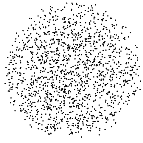
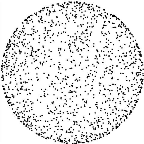
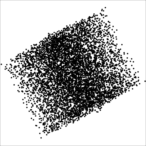
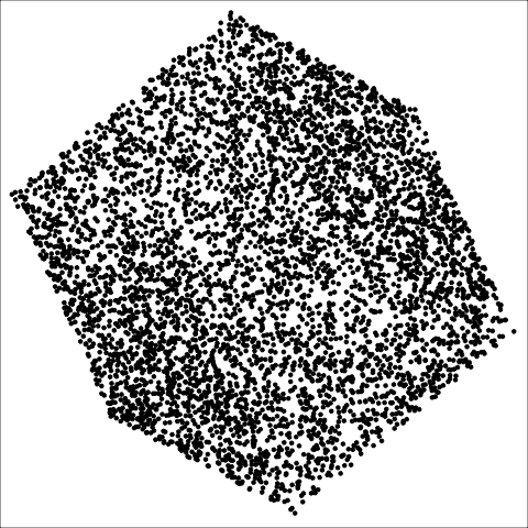
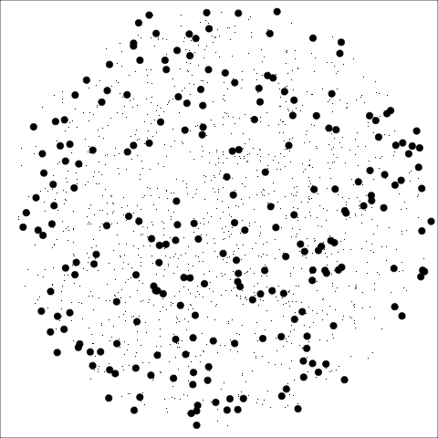
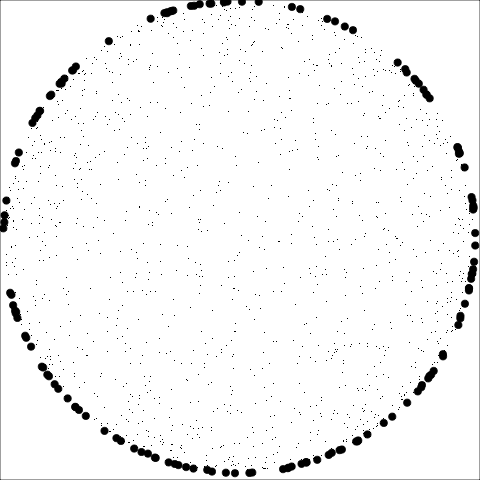
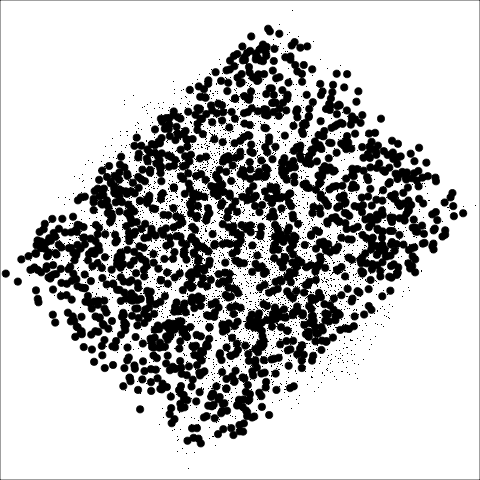
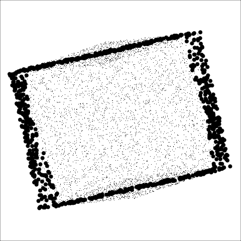
## High-dimensional shapes: shadows and slices
```{r}
#| eval: false
#| echo: false
set.seed(1156)
hd1 <- as_tibble(geozoo::sphere.solid.random()$points)
hd2 <- as_tibble(geozoo::sphere.hollow()$points)
hd3 <- as_tibble(geozoo::cube.solid.random()$points)
hd4 <- as_tibble(geozoo::cube.face()$points)
render_gif(hd1, grand_tour(), display_xy(axes="off"),
gif_file = "images/sphere_solid.gif",
frames = 50,
start = basis_random(3,2)
)
render_gif(hd2, grand_tour(), display_xy(axes="off"),
gif_file = "images/sphere_hollow.gif",
frames = 50,
start = basis_random(3,2)
)
render_gif(hd3, grand_tour(), display_xy(axes="off"),
gif_file = "images/cube_solid.gif",
frames = 50,
start = basis_random(3,2)
)
render_gif(hd4, grand_tour(), display_xy(axes="off"),
gif_file = "images/cube_hollow.gif",
frames = 50,
start = basis_random(3,2)
)
render_gif(hd1, grand_tour(), display_slice(axes="off"),
gif_file = "images/sphere_solid_slice.gif",
frames = 50,
start = basis_random(3,2)
)
render_gif(hd2, grand_tour(), display_slice(axes="off"),
gif_file = "images/sphere_hollow_slice.gif",
frames = 50,
start = basis_random(3,2)
)
render_gif(hd3, grand_tour(), display_slice(axes="off"),
gif_file = "images/cube_solid_slice.gif",
frames = 50,
start = basis_random(3,2)
)
render_gif(hd4, grand_tour(), display_slice(axes="off"),
gif_file = "images/cube_hollow_slice.gif",
frames = 50,
start = basis_random(3,2)
)
```
::: {.fragment}
:::
## Low-dimensional shapes in high-dimensions
```{r}
#| eval: false
#| echo: false
set.seed(116)
ld1 <- tibble(V1=runif(365), V2=runif(365, -0.01, 0.01),
V3=runif(365, -0.01, 0.01))
ld2 <- tibble(V1=runif(365), V2=runif(365),
V3=runif(365, -0.01, 0.01))
ld3 <- tibble(V1=runif(365), V2=V1^2,
V3=runif(365, -0.01, 0.01))
ld4 <- tibble(V1=runif(365), V2=V1^2,
V3=runif(365))
render_gif(ld1, grand_tour(), display_xy(axes="off"),
gif_file = "images/1d_in_3d.gif",
frames = 50,
start = basis_random(3,2)
)
render_gif(ld2, grand_tour(), display_xy(axes="off"),
gif_file = "images/2d_in_3d.gif",
frames = 50,
start = basis_random(3,2)
)
render_gif(ld3, grand_tour(), display_xy(axes="off"),
gif_file = "images/nl_1d_in_3d.gif",
frames = 50,
start = basis_random(3,2)
)
render_gif(ld4, grand_tour(), display_xy(axes="off"),
gif_file = "images/nl_2d_in_3d.gif",
frames = 50,
start = basis_random(3,2)
)
render_gif(ld1, grand_tour(), display_slice(axes="off"),
gif_file = "images/1d_in_3d_slice.gif",
frames = 50,
start = basis_random(3,2)
)
render_gif(ld2, grand_tour(), display_slice(axes="off"),
gif_file = "images/2d_in_3d_slice.gif",
frames = 50,
start = basis_random(3,2)
)
render_gif(ld3, grand_tour(), display_slice(axes="off"),
gif_file = "images/nl_1d_in_3d_slice.gif",
frames = 50,
start = basis_random(3,2)
)
render_gif(ld4, grand_tour(), display_slice(axes="off"),
gif_file = "images/nl_2d_in_3d_slice.gif",
frames = 50,
start = basis_random(3,2)
)
```
## What is high-dimensions?
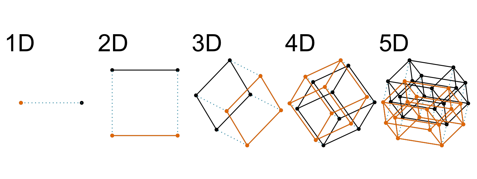 When all variables are quantitative, an extra variable adds an extra orthogonal axis. It has a name, [Euclidean space]{.monash-blue2} which dates back to the [ancient Greeks](https://en.wikipedia.org/wiki/Euclidean_geometry).
## Features to find
:::: {.columns}
::: {.column width=80%}
```{r}
#| label: feature-table2
#| echo: false
tribble(
~Feature, ~Example, ~Description,
"linear form", "", "The shape is linear",
"nonlinear form", "", "The shape is more of a curve",
"outliers", "", "There are one or more points that do not fit the pattern on the others",
"clusters", "", "The observations group into multiple clumps",
"gaps", "", "There is a gap, or gaps, but its not clumped",
"barrier", "", "There is combination of the variables which appears impossible",
"l-shape", "", "When one variable changes the other is approximately constant",
"discreteness", "", "Relationship between two variables is different from the overall, and observations are in a striped pattern",
) |>
knitr::kable(escape = FALSE) |>
kableExtra::kable_classic() |>
kableExtra::kable_styling(font_size=24,
full_width=FALSE) |>
kableExtra::column_spec(2,
image=spec_image(
c("../images/scatterplots2-1.png",
"../images/scatterplots2-2.png",
"../images/scatterplots2-4.png",
"../images/scatterplots2-5.png",
"../images/scatterplots2-6.png",
"../images/scatterplots3-1.png",
"../images/scatterplots3-2.png",
"../images/scatterplots3-3.png"), width=120, height=120))
```
:::
::: {.column width=20%}
Any of the features from 2D are patterns to find in higher dimensions.
:::
::::
## A movie of linear combinations: tour {.transition-slide .center style="text-align: center;"}
## Grand tour
:::: {.columns}
::: {.column}
```{r}
#| code-fold: true
#| code-summary: data-processing
library(palmerpenguins)
f_std <- function(x) (x-mean(x, na.rm=TRUE))/sd(x, na.rm=TRUE)
p_std <- penguins |>
select(bill_length_mm:body_mass_g, species) |>
dplyr::rename(bl = bill_length_mm,
bd = bill_depth_mm,
fl = flipper_length_mm,
bm = body_mass_g) |>
na.omit() |>
dplyr::mutate(bl = f_std(bl),
bd = f_std(bd),
fl = f_std(fl),
bm = f_std(bm))
```
```{r}
#| eval: false
#| code-fold: true
animate_xy(p_std[,1:4], axes="off")
render_gif(p_std[,1:4], grand_tour(), display_xy(axes="off"),
gif_file = "images/penguins_grand.gif",
frames = 50,
start = basis_random(4,2))
```
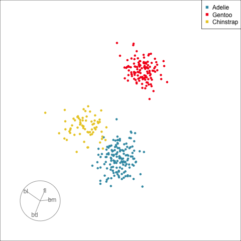
How many clusters?
:::
::: {.column}
::: {.fragment}
```{r}
#| eval: false
#| code-fold: true
animate_xy(p_std[,1:4], axes="off", col=p_std$species)
render_gif(p_std[,1:4], grand_tour(),
display_xy(col=p_std$species, axes="off"),
gif_file = "images/penguins_grand_sp.gif",
frames = 50,
start = basis_random(4,2))
```
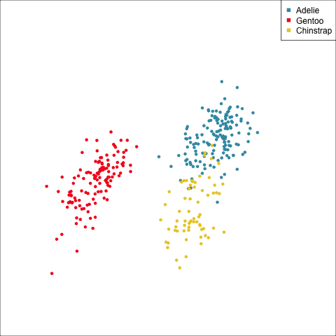
The clusters correspond the three species.
:::
:::
::::
## What does linear combination of variables mean?
```{r eval=FALSE, echo=FALSE, warning=FALSE}
#| eval: false
#| echo: false
#| warning: false
set.seed(537)
bases <- save_history(p_std[,1:4], grand_tour(2),
start=basis_random(4,2),
max = 3)
# Re-set start bc seems to go awry
tour_path <- interpolate(bases, 0.1)
d <- dim(tour_path)
mydat <- NULL; myaxes <- NULL
for (i in 1:d[3]) {
fp <- as.matrix(p_std[,1:4]) %*% matrix(tour_path[,,i], ncol=2)
fp <- tourr::center(fp)
colnames(fp) <- c("d1", "d2")
mydat <- rbind(mydat, cbind(fp, rep(i+10, 2*nrow(fp))))
fa <- cbind(matrix(0, 4, 2), matrix(tour_path[,,i], ncol=2))
colnames(fa) <- c("origin1", "origin2", "d1", "d2")
myaxes <- rbind(myaxes, cbind(fa, rep(i+10, 2*nrow(fa))))
}
colnames(mydat)[3] <- "indx"
colnames(myaxes)[5] <- "indx"
df <- as_tibble(mydat) |>
mutate(species = rep(p_std$species, d[3]))
dfaxes <- as_tibble(myaxes) |>
mutate(labels=rep(colnames(p_std[,1:4]), d[3]))
dfaxes_mat <- dfaxes |>
mutate(xloc = rep(max(df$d1)+1, d[3]*4),
yloc=rep(seq(2, -2, -1.3), d[3]),
coef=paste(round(dfaxes$d1, 2), ", ",
round(dfaxes$d2, 2)))
p <- ggplot() +
geom_segment(data=dfaxes, aes(x=d1*2-3,
xend=origin1-3,
y=d2*2,
yend=origin2,
frame = indx),
colour="grey70") +
geom_text(data=dfaxes, aes(x=d1*2-3,
y=d2*2,
label=labels,
frame = indx),
colour="grey70") +
geom_point(data = df, aes(x = d1,
y = d2,
colour=species,
frame = indx), size=1) +
geom_text(data=dfaxes_mat, aes(x=xloc, y=yloc,
label=coef, frame = indx)) +
scale_colour_discrete_divergingx(palette = "Zissou 1") +
theme_void() +
coord_fixed() +
theme(legend.position="none")
pg <- ggplotly(p, width=600, height=550) |>
animation_opts(200, redraw = FALSE,
easing = "linear", transition=0)
save_html(pg, file="images/penguins4d.html")
```
Click to see demo
When all variables are quantitative, an extra variable adds an extra orthogonal axis. It has a name, [Euclidean space]{.monash-blue2} which dates back to the [ancient Greeks](https://en.wikipedia.org/wiki/Euclidean_geometry).
## Features to find
:::: {.columns}
::: {.column width=80%}
```{r}
#| label: feature-table2
#| echo: false
tribble(
~Feature, ~Example, ~Description,
"linear form", "", "The shape is linear",
"nonlinear form", "", "The shape is more of a curve",
"outliers", "", "There are one or more points that do not fit the pattern on the others",
"clusters", "", "The observations group into multiple clumps",
"gaps", "", "There is a gap, or gaps, but its not clumped",
"barrier", "", "There is combination of the variables which appears impossible",
"l-shape", "", "When one variable changes the other is approximately constant",
"discreteness", "", "Relationship between two variables is different from the overall, and observations are in a striped pattern",
) |>
knitr::kable(escape = FALSE) |>
kableExtra::kable_classic() |>
kableExtra::kable_styling(font_size=24,
full_width=FALSE) |>
kableExtra::column_spec(2,
image=spec_image(
c("../images/scatterplots2-1.png",
"../images/scatterplots2-2.png",
"../images/scatterplots2-4.png",
"../images/scatterplots2-5.png",
"../images/scatterplots2-6.png",
"../images/scatterplots3-1.png",
"../images/scatterplots3-2.png",
"../images/scatterplots3-3.png"), width=120, height=120))
```
:::
::: {.column width=20%}
Any of the features from 2D are patterns to find in higher dimensions.
:::
::::
## A movie of linear combinations: tour {.transition-slide .center style="text-align: center;"}
## Grand tour
:::: {.columns}
::: {.column}
```{r}
#| code-fold: true
#| code-summary: data-processing
library(palmerpenguins)
f_std <- function(x) (x-mean(x, na.rm=TRUE))/sd(x, na.rm=TRUE)
p_std <- penguins |>
select(bill_length_mm:body_mass_g, species) |>
dplyr::rename(bl = bill_length_mm,
bd = bill_depth_mm,
fl = flipper_length_mm,
bm = body_mass_g) |>
na.omit() |>
dplyr::mutate(bl = f_std(bl),
bd = f_std(bd),
fl = f_std(fl),
bm = f_std(bm))
```
```{r}
#| eval: false
#| code-fold: true
animate_xy(p_std[,1:4], axes="off")
render_gif(p_std[,1:4], grand_tour(), display_xy(axes="off"),
gif_file = "images/penguins_grand.gif",
frames = 50,
start = basis_random(4,2))
```

How many clusters?
:::
::: {.column}
::: {.fragment}
```{r}
#| eval: false
#| code-fold: true
animate_xy(p_std[,1:4], axes="off", col=p_std$species)
render_gif(p_std[,1:4], grand_tour(),
display_xy(col=p_std$species, axes="off"),
gif_file = "images/penguins_grand_sp.gif",
frames = 50,
start = basis_random(4,2))
```

The clusters correspond the three species.
:::
:::
::::
## What does linear combination of variables mean?
```{r eval=FALSE, echo=FALSE, warning=FALSE}
#| eval: false
#| echo: false
#| warning: false
set.seed(537)
bases <- save_history(p_std[,1:4], grand_tour(2),
start=basis_random(4,2),
max = 3)
# Re-set start bc seems to go awry
tour_path <- interpolate(bases, 0.1)
d <- dim(tour_path)
mydat <- NULL; myaxes <- NULL
for (i in 1:d[3]) {
fp <- as.matrix(p_std[,1:4]) %*% matrix(tour_path[,,i], ncol=2)
fp <- tourr::center(fp)
colnames(fp) <- c("d1", "d2")
mydat <- rbind(mydat, cbind(fp, rep(i+10, 2*nrow(fp))))
fa <- cbind(matrix(0, 4, 2), matrix(tour_path[,,i], ncol=2))
colnames(fa) <- c("origin1", "origin2", "d1", "d2")
myaxes <- rbind(myaxes, cbind(fa, rep(i+10, 2*nrow(fa))))
}
colnames(mydat)[3] <- "indx"
colnames(myaxes)[5] <- "indx"
df <- as_tibble(mydat) |>
mutate(species = rep(p_std$species, d[3]))
dfaxes <- as_tibble(myaxes) |>
mutate(labels=rep(colnames(p_std[,1:4]), d[3]))
dfaxes_mat <- dfaxes |>
mutate(xloc = rep(max(df$d1)+1, d[3]*4),
yloc=rep(seq(2, -2, -1.3), d[3]),
coef=paste(round(dfaxes$d1, 2), ", ",
round(dfaxes$d2, 2)))
p <- ggplot() +
geom_segment(data=dfaxes, aes(x=d1*2-3,
xend=origin1-3,
y=d2*2,
yend=origin2,
frame = indx),
colour="grey70") +
geom_text(data=dfaxes, aes(x=d1*2-3,
y=d2*2,
label=labels,
frame = indx),
colour="grey70") +
geom_point(data = df, aes(x = d1,
y = d2,
colour=species,
frame = indx), size=1) +
geom_text(data=dfaxes_mat, aes(x=xloc, y=yloc,
label=coef, frame = indx)) +
scale_colour_discrete_divergingx(palette = "Zissou 1") +
theme_void() +
coord_fixed() +
theme(legend.position="none")
pg <- ggplotly(p, width=600, height=550) |>
animation_opts(200, redraw = FALSE,
easing = "linear", transition=0)
save_html(pg, file="images/penguins4d.html")
```
Click to see demo
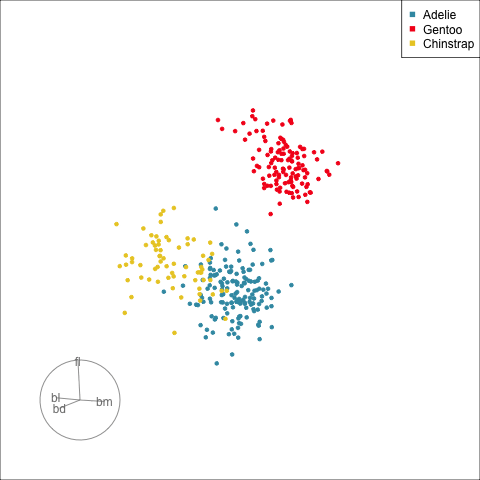
If your data values are *`r p_std[1, 1:4]`* and the coefficients are *`r set.seed(859); rb <- basis_random(4, 1); rb`* then the projected data value is *`r sum(p_std[1, 1:4]*rb)`*. It's [like a regression equation]{.monash-blue2}.
To make a scatterplot, [two linear combinations]{.monash-orange2} are used. *With [special care]{.monash-orange2}: (1) the sum of square of each equals 1, and (2) the sum of the product of the two linear combinations equals 0*.
## Guided tour
:::: {.columns}
::: {.column}
```{r}
#| eval: false
#| code-fold: true
set.seed(815)
proj <- animate_xy(p_std[,1:4],
guided_tour(lda_pp(p_std$species)),
start = basis_random(4,2),
axes="bottomleft", col=p_std$species)
best_proj <- proj$basis[314][[1]]
colnames(best_proj) <- c("PP1", "PP2")
rownames(best_proj) <- colnames(p_std[,1:4])
set.seed(815)
render_gif(p_std[,1:4],
guided_tour(lda_pp(p_std$species)),
display_xy(col=p_std$species, axes="bottomleft"),
gif_file = "images/penguins_guided.gif",
frames = 50,
start = basis_random(4,2),
loop = FALSE)
```
:::
::: {.column}
[Define what structure is interesting]{.monash-blue2}, numerically, calculated by a function. Use an optimiser to choose linear combinations that maximise this function.
*More on creating functions defining interesting structure soon!*
:::
::::
## Manual/radial tour
:::: {.columns}
::: {.column}
```{r}
#| eval: false
#| code-fold: true
set.seed(829)
animate_xy(p_std[,1:4],
radial_tour(best_proj, mvar=3),
axes="bottomleft", col=p_std$species)
# Generate a path that shows multiple variables being rotated ou
set.seed(829)
p_rad_fl <- save_history(p_std[,1:4],
radial_tour(best_proj, mvar=3),
max_bases = 3)
p_rad_bd <- save_history(p_std[,1:4],
radial_tour(best_proj, mvar=2),
max_bases = 3)
p_rad_bl <- save_history(p_std[,1:4],
radial_tour(best_proj, mvar=1),
max_bases = 3)
p_rad <- array(dim = c(4, 2, 7))
p_rad[,,1:3] <- p_rad_fl
p_rad[,,4:5] <- p_rad_bd[,,2:3]
p_rad[,,6:7] <- p_rad_bl[,,2:3]
class(p_rad) <- "history_array"
animate_xy(p_std[,1:4],
planned_tour(p_rad),
axes="bottomleft", col=p_std$species)
render_gif(p_std[,1:4],
planned_tour(p_rad),
display_xy(col=p_std$species, axes="bottomleft"),
gif_file = "images/penguins_radial.gif",
frames = 100)
```
:::
::: {.column}
[Remove a variable]{.monash-blue2} to see what the change to the pattern is.
Use this to assess whether a [variable is important]{.monash-blue2} for a pattern, and hence the relationship between multiple variables.
:::
::::
## Scale your data!
:::: {.columns}
::: {.column}
::: {.info}
The scale of the variables can affect how you see the relationships between multiple variables.
:::
:::
::: {.column}
Generally, [each variable should be scaled]{.monash-blue2} to have mean 0, standard deviation 1. (Or min -1 and max 1.)
If different scales on different variables is meaningful, and they are in the same units, you can scale with [global]{.monash-blue2} mean and standard deviation (or minimum and maximum).
:::
::::
## Static plots of multivariate data {.transition-slide .center style="text-align: center;"}
## Simpler: scatterplot matrix
:::: {.columns}
::: {.column}
```{r}
#| code-fold: true
#| fig-width: 6
#| fig-height: 6
ggscatmat(p_std, columns=1:4, col="species", alpha=0.5) +
scale_color_discrete_divergingx(palette="Zissou 1") +
theme(axis.text = element_blank())
```
:::
::: {.column}
Plot
- all the pairs of variables.
- univariate distributions.
- maybe show correlations, too.
:::
::::
## Parallel coordinate plot
:::: {.columns}
::: {.column width=60%}
```{r}
#| code-fold: true
p_std |>
pcp_select(1:5) |> # select everything
pcp_arrange() |>
ggplot(aes_pcp(colour=species)) +
geom_pcp() +
scale_color_discrete_divergingx(palette = "Zissou 1") +
theme_pcp()
```
:::
::: {.column width=40%}
Like side-by-side dot plots, where points are connected.
Look for patterns in the lines, such as
- grouped together indicating clustering.
- some lines going in different directions, indicating outliers.
- parallel or crossing lines, indicating linear positive and negative association.
:::
::::
## What you might miss without a tour {.transition-slide .center style="text-align: center;"}
## Hidden structure [(1/3)]{.smallest}
:::: {.columns}
::: {.column}
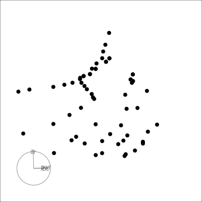
Many relationships can only be seen when multiple variables are combined:
- outlier(s)
- clustering
- non-linearity
::: {.fragment}
*Example from my experience with early experiments in laser equipment construction.*
:::
:::
::: {.column}
::: {.fragment}
```{r}
#| echo: false
#| fig-width: 9
#| fig-height: 3
laser <- read_csv("../data/laser.csv")
laser_std <- laser |>
mutate_at(vars(ifront:lambda), f_std)
l1 <- ggplot(laser, aes(x=ifront, y=iback)) +
geom_point()
l2 <- ggplot(laser, aes(x=ifront, y=power)) +
geom_point()
l3 <- ggplot(laser, aes(x=iback, y=power)) +
geom_point()
l1 + l2 + l3 + plot_layout(ncol=3)
```
:::
::: {.fragment}
```{r}
#| echo: false
#| eval: false
set.seed(1044)
animate_xy(laser_std[,2:4], axes="bottomleft")
render_gif(laser_std[,2:4],
grand_tour(),
display_xy(axes="bottomleft", cex=2),
gif_file = "images/laser.gif",
frames = 50,
width = 400, height = 400,
start = basis_random(3,2))
```
{width=400}
:::
:::
::::
## Hidden structure [(2/3)]{.smallest}
:::: {.columns}
::: {.column}
```{r}
#| echo: false
#| label: hiding
#| fig-width: 6
#| fig-height: 6
#| out-width: 80%
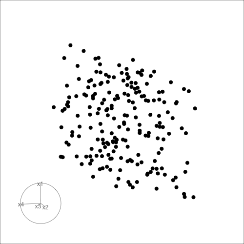
set.seed(946)
d <- tibble(x1=runif(200, -1, 1),
x2=runif(200, -1, 1),
x3=runif(200, -1, 1))
d <- d |>
mutate(x4 = x3 + runif(200, -0.1, 0.1))
d <- bind_rows(d, c(x1=0, x2=0, x3=-0.5, x4=0.5))
d_r <- d |>
mutate(x1 = cos(pi/6)*x1 + sin(pi/6)*x3,
x3 = -sin(pi/6)*x1 + cos(pi/6)*x3,
x2 = cos(pi/6)*x2 + sin(pi/6)*x4,
x4 = -sin(pi/6)*x2 + cos(pi/6)*x4)
ggscatmat(d_r) + theme(axis.text = element_blank())
```
Can you see an anomaly?
:::
::: {.column}
::: {.fragment}
```{r}
#| echo: false
#| eval: false
set.seed(1104)
animate_xy(d_r, axes="bottomleft")
render_gif(d_r,
grand_tour(),
display_xy(
axes="bottomleft", cex=2),
gif_file = "images/anomaly.gif",
start = basis_random(4, 2),
frames = 100,
width = 500,
height = 500)
```
Can you see it now?
:::
:::
::::
## Hidden structure [(3/3)]{.smallest}
:::: {.columns}
::: {.column}
```{r}
#| echo: false
#| label: clusters
#| fig-width: 6
#| fig-height: 6
#| out-width: 80%
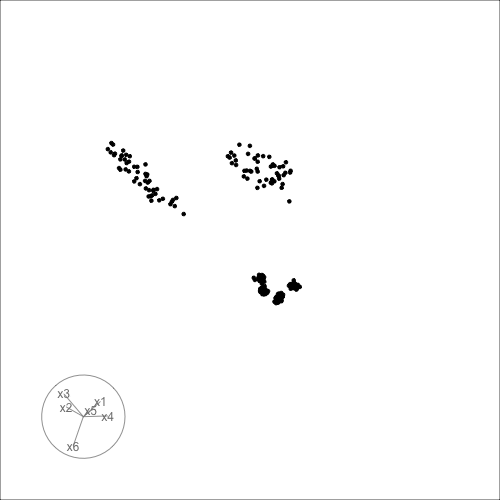
ggscatmat(c1) + theme(axis.text = element_blank())
```
How many clusters?
:::
::: {.column}
::: {.fragment}
```{r}
#| echo: false
#| eval: false
set.seed(1149)
animate_xy(c1, axes="bottomleft")
render_gif(c1,
grand_tour(),
display_xy(
axes="bottomleft"),
gif_file = "images/clusters.gif",
start = basis_random(6, 2),
frames = 100,
width = 500,
height = 500)
```
How many can you see now?
:::
:::
::::
## Famous example: RANDU
:::: {.columns}
::: {.column}
RANDU[1] is a linear congruential pseudorandom number generator (LCG) used primarily in the 1960s and 1970s. Using RANDU for sampling a unit cube will only sample 15 parallel planes. As a result of the wide use of RANDU in the early 1970s, many results from that time are seen as suspicious.
[[Read more on wikipedia](https://en.wikipedia.org/wiki/RANDU)]{.smaller}
:::
::: {.column}
```{r}
#| code-fold: true
#| eval: false
set.seed(1031)
data(randu)
randu_std <- as.data.frame(apply(randu, 2, function(x) (x-mean(x))/sd(x)))
animate_xy(randu_std, axes="off")
render_gif(randu_std, grand_tour(),
display_xy(axes="bottomleft"),
gif_file = "images/randu.gif",
frames = 50,
start = basis_random(3,2))
```
:::
::::
## Automating the search with scagnostics {.transition-slide .center style="text-align: center;"}
## Scagnostics
:::: {.columns}
::: {.column style="font-size: 80%; width: 70%;"}
```{r}
#| label: generate-data
#| echo: false
set.seed(0903)
df <- tibble(x=1:10, y=c(1:4,6,6:10), set="line") |>
bind_rows(tibble(x=rnorm(100), y=rnorm(100), set="norm"))
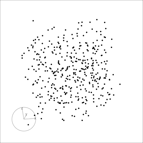
d <- as_tibble(sphere.hollow(p=2, n=100)$points) |>
rename(x = V1, y = V2) |>
mutate(set = "circle")
df <- df |>
bind_rows(d)
d <- flea |>
select(tars2, head) |>
mutate(head = jitter(head, factor=0.1)) |>
rename(x=tars2, y=head) |>
mutate(set = "stripes")
df <- df |>
bind_rows(d)
d <- flea |>
select(tars1, aede1) |>
mutate(tars1 = jitter(tars1, factor=0.1),
aede1 = jitter(aede1, factor=0.1)) |>
rename(x=tars1, y=aede1) |>
mutate(set = "clumps")
df <- df |>
bind_rows(d) |>
mutate(set = factor(set,
levels = c("line", "norm", "circle", "stripes", "clumps")))
```
```{r}
#| label: scagplots
#| fig-width: 2
#| fig-height: 2
#| include: false
#| echo: false
df |>
filter(set == "line") |>
ggplot(aes(x, y)) +
geom_point() +
theme(axis.text = element_blank(),
axis.title = element_blank())
df |>
filter(set == "norm") |>
ggplot(aes(x, y)) +
geom_point() +
theme(axis.text = element_blank(),
axis.title = element_blank())
df |>
filter(set == "circle") |>
ggplot(aes(x, y)) +
geom_point() +
theme(axis.text = element_blank(),
axis.title = element_blank())
df |>
filter(set == "stripes") |>
ggplot(aes(x, y)) +
geom_point() +
theme(axis.text = element_blank(),
axis.title = element_blank())
df |>
filter(set == "clumps") |>
ggplot(aes(x, y)) +
geom_point() +
theme(axis.text = element_blank(),
axis.title = element_blank())
```
```{r}
#| label: scagnostics
#| code-fold: true
s <- df |>
group_by(set) |>
summarise(calc_scags(x, y,
scags = c("outlying", "stringy", "striated",
"clumpy", "sparse",
"monotonic", "dcor"))) |>
mutate(plot = "") |>
select(plot, set, outlying, stringy, striated,
clumpy, sparse, monotonic, dcor)
```
```{r}
#| echo: false
s |>
kbl(booktabs = T, digits = 3) |>
kable_paper(full_width = F) |>
column_spec(1, image = spec_image(
c("../images/scagplots-1.png",
"../images/scagplots-2.png",
"../images/scagplots-3.png",
"../images/scagplots-4.png",
"../images/scagplots-5.png"),
250, 250))
```
:::
::: {.column style="font-size: 80%; width: 20%;"}
- clumpy
- convex
- dcor
- monotonic
- outlying
- skewed
- skinny
- sparse
- splines
- striated
- stringy
- striped
:::
::::
## How are scagnostics calculated? [(1/3)]{.smallest}
The building blocks are: convex hull, alpha hull, and minimal spanning tree
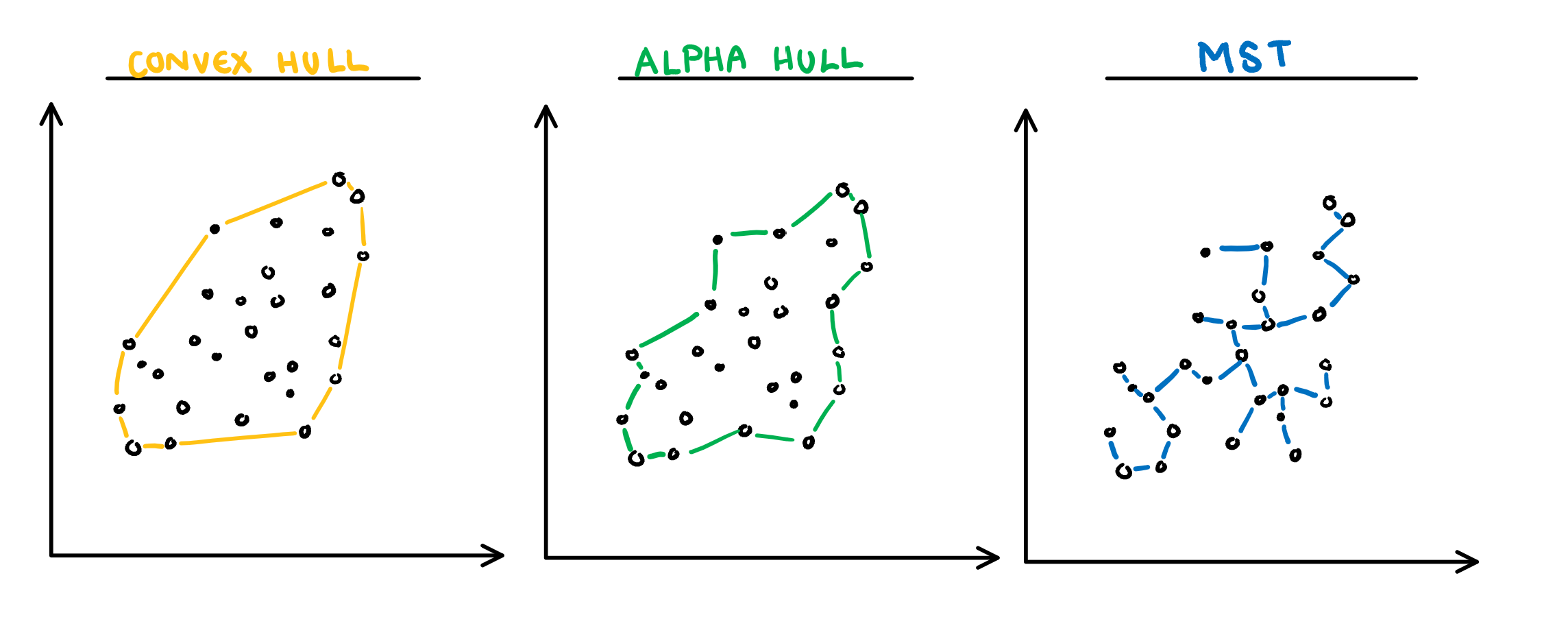 [Sketches made by Harriet Mason]{.smallest}
## How are scagnostics calculated? [(2/3)]{.smallest}
:::: {.columns}
::: {.column}
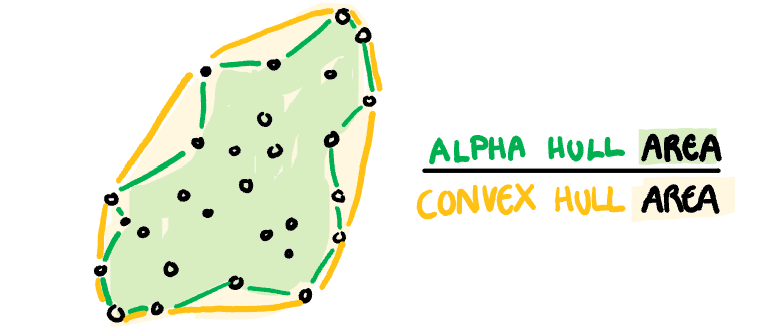
**Convex:** Measure of how convex the shape of the data is. Computed as the ratio between the area of the alpha hull (A) and convex hull (C).
[Sketches made by Harriet Mason]{.smallest}
## How are scagnostics calculated? [(2/3)]{.smallest}
:::: {.columns}
::: {.column}
**Convex:** Measure of how convex the shape of the data is. Computed as the ratio between the area of the alpha hull (A) and convex hull (C).
 :::
::: {.column}
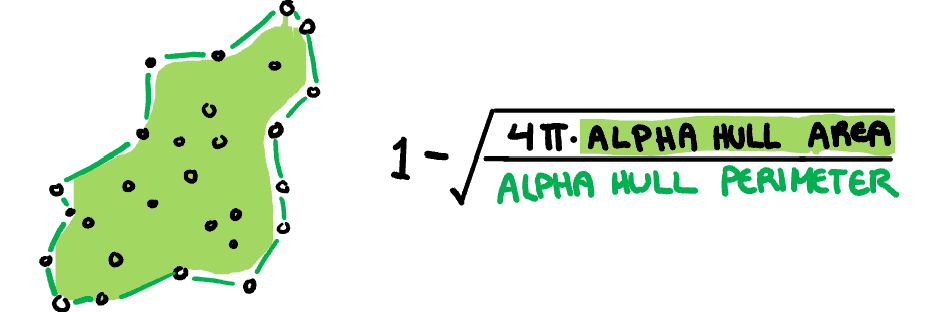
**Skinny:** A measure of how "thin" the shape of the data is. It is calculated as the ratio between the area and perimeter of the alpha hull (A) with some normalisation such that 0 correspond to a perfect circle and values close to 1 indicate a skinny polygon.
:::
::: {.column}
**Skinny:** A measure of how "thin" the shape of the data is. It is calculated as the ratio between the area and perimeter of the alpha hull (A) with some normalisation such that 0 correspond to a perfect circle and values close to 1 indicate a skinny polygon.
 :::
::::
[Sketches made by Harriet Mason]{.smallest}
## How are scagnostics calculated? [(3/3)]{.smallest}
:::: {.columns}
::: {.column}
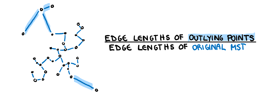
**Outlying:** A measure of proportion and severity of outliers in dataset. Calculated by comparing the edge lengths of the outlying points in the MST with the length of the entire MST.
:::
::::
[Sketches made by Harriet Mason]{.smallest}
## How are scagnostics calculated? [(3/3)]{.smallest}
:::: {.columns}
::: {.column}
**Outlying:** A measure of proportion and severity of outliers in dataset. Calculated by comparing the edge lengths of the outlying points in the MST with the length of the entire MST.
 :::
::: {.column}
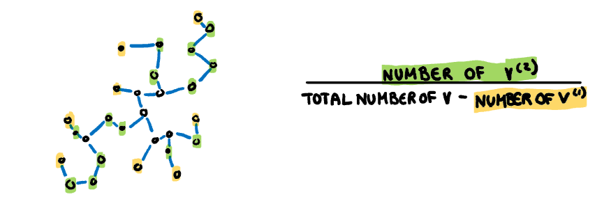
**Stringy:** This measure identifies a "stringy" shape with no branches, such as a thin line of data. It is calculated by comparing the number of vertices of degree two $(V^{(2)})$ with the total number of vertices $(V)$, dropping those of degree one $(V^{(1)})$.
:::
::: {.column}
**Stringy:** This measure identifies a "stringy" shape with no branches, such as a thin line of data. It is calculated by comparing the number of vertices of degree two $(V^{(2)})$ with the total number of vertices $(V)$, dropping those of degree one $(V^{(1)})$.
 :::
::::
[Sketches made by Harriet Mason]{.smallest}
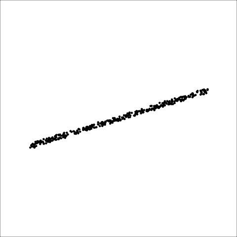
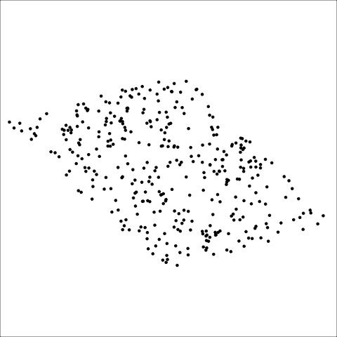
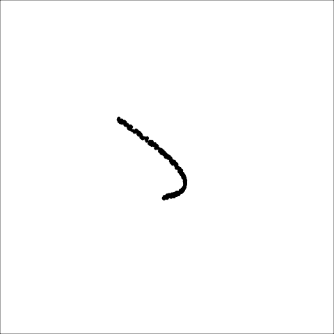
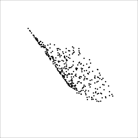
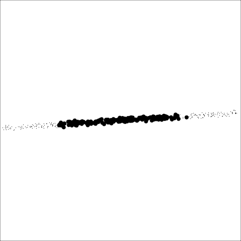
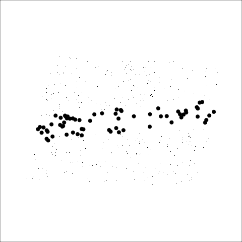
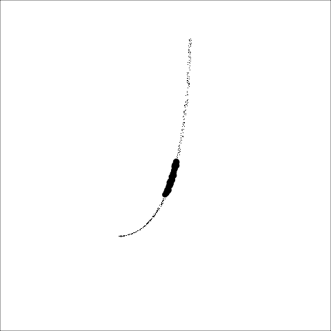
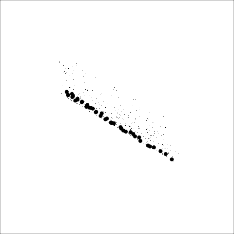
## Scagnostics from familiar measures
There are many more ways to numerically characterise association that can be used as scagnostics too:
- We used those available in the [cassowaryr](https://numbats.github.io/cassowaryr/) R package
- [Slope, intercept, error, $R^2$]{.monash-blue2} from a simple linear model
- Also beyond scatterplots there are:
- [tignostics]{.monash-blue2} for time series ([feasts](https://feasts.tidyverts.org) R package)
- [longnostics]{.monash-blue2} for longitudinal data ([brolgar](http://brolgar.njtierney.com) R package)
## Linking elements of multiple plots {.transition-slide .center style="text-align: center;"}
## Brushing in a scatterplot matrix
:::: {.columns}
::: {.column}
:::
::::
[Sketches made by Harriet Mason]{.smallest}
## Scagnostics from familiar measures
There are many more ways to numerically characterise association that can be used as scagnostics too:
- We used those available in the [cassowaryr](https://numbats.github.io/cassowaryr/) R package
- [Slope, intercept, error, $R^2$]{.monash-blue2} from a simple linear model
- Also beyond scatterplots there are:
- [tignostics]{.monash-blue2} for time series ([feasts](https://feasts.tidyverts.org) R package)
- [longnostics]{.monash-blue2} for longitudinal data ([brolgar](http://brolgar.njtierney.com) R package)
## Linking elements of multiple plots {.transition-slide .center style="text-align: center;"}
## Brushing in a scatterplot matrix
:::: {.columns}
::: {.column}
Selecting points using a square "brush", using `plotly`, allows you to see where observations lie in the other plots (pairs of variables).
:::
::: {.column}
```{r}
#| code-fold: true
highlight_key(p_std) |>
ggpairs(columns = 1:4) |>
ggplotly(width=600, height=600) |>
highlight("plotly_selected")
```
:::
::::
## Linking between a tour and a scatterplot
```{r}
#| eval: false
#| code-fold: true
#| code-summary: Demo
library(detourr)
library(dplyr)
library(crosstalk)
library(plotly)
p_all <- penguins |>
rename(bl = bill_length_mm,
bd = bill_depth_mm,
fl = flipper_length_mm,
bm = body_mass_g) |>
filter(!is.na(bl)) |>
mutate(bl = f_std(bl),
bd = f_std(bd),
fl = f_std(fl),
bm = f_std(bm)) |>
mutate(island_i = as.integer(island),
sex_i = as.integer(sex)) |>
mutate(island_i = jitter(island_i),
sex_i = jitter(sex_i)) |>
select(bl:bm, species, island_i, sex_i, island, sex)
shared_p_all <- SharedData$new(p_all)
detour_plot <- detour(shared_p_all,
tour_aes(projection = bl:bm,
colour = species)) |>
tour_path(grand_tour(2),
max_bases=50, fps = 60) |>
show_scatter(alpha = 0.7, axes = FALSE,
width = "100%", height = "450px",
palette = pal_brewer(type = "qual",
palette = "Dark2"))
demog_plot <- plot_ly(shared_p_all,
x = ~island_i,
y = ~sex_i,
color = ~species,
text = ~island,
colors = "Dark2",
height = 450) |>
highlight(on = "plotly_selected",
off = "plotly_doubleclick") |>
add_trace(type = "scatter",
mode = "markers",
hoverinfo = 'text')
bscols(
detour_plot, demog_plot,
widths = c(5, 6)
)
```
Linking between plots allows some queries to be made interactively. The penguins data has variables, `sex` and `island` which provide more information.
This demo code is setup to learn more the penguins: a [(jittered) scatterplot]{.monash-blue2} shows island and sex, and a [tour]{.monash-blue2} shows the four size measurements.
*What can you learn in response to these questions?*
1. Is the size of the penguins different between the sexes?
2. How does the size differ between penguins recorded at different locations?
3. Which island did the outlier come from?
## Exploring multiple categorical variables {.transition-slide .center style="text-align: center;"}
## Facetted plots
:::: {.columns}
::: {.column width=70%}
```{r}
#| echo: false
#| fig-height: 7
#| fig-width: 10
#| out-width: 100%
# https://www.who.int/teams/global-tuberculosis-programme/data
tb <- read_csv(here::here("data/TB_notifications_2023-08-21.csv"))
tb_sub <- tb |>
filter(iso3 %in% c("AUS", "NZL"), between(year, 1997, 2012)) |>
select(year, iso3, contains("new_sp")) |>
select(-new_sp, -new_sp_m04, -new_sp_m514,
-new_sp_m014, -new_sp_f014,
-new_sp_mu, -new_sp_f04, -new_sp_f514,
-new_sp_fu) |>
pivot_longer(new_sp_m1524:new_sp_f65,
names_to="var", values_to="count") |>
mutate(var = str_remove(var, "new_sp_")) |>
mutate(sex = str_sub(var, 1, 1),
age = str_sub(var, 2, length(var))) |>
select(-var)
tb_sub |>
ggplot(aes(x=year, y=count, fill=age)) +
geom_col() +
scale_fill_discrete_divergingx(palette = "Zissou 1") +
facet_grid(iso3+sex~age, scales="free_y") +
xlab("") + ylab("count") +
theme(aspect.ratio=0.8, legend.position = "none")
```
:::
::: {.column width=30%}
Additional variables can be [folded in to]{.monash-blue2} horizontal and vertical facets.
[Ordering]{.monash-blue2} could be important to change, and [scales]{.monash-blue2} on the axes need care.
Switching to [proportions]{.monash-blue2} may allow direct comparison.
:::
::::
## Tabulation
:::: {.columns}
::: {.column}
Overall counts
```{r}
#| echo: false
tb_sub |>
filter(iso3 == "AUS") |>
group_by(age, sex) |>
summarise(count = sum(count)) |>
ungroup() |>
pivot_wider(names_from = sex, values_from = count) |>
as_tabyl() |>
adorn_totals() |>
kbl() |>
row_spec(6, hline_after=TRUE) |>
row_spec(7, bold=TRUE)
```
:::
::: {.column}
::: {.fragment}
::: {style="font-size: 80%;"}
```{r}
#| echo: false
tb_sub |>
filter(iso3 == "AUS") |>
group_by(age, sex) |>
summarise(count = sum(count)) |>
ungroup() |>
pivot_wider(names_from = sex, values_from = count) |>
as_tabyl() |>
adorn_totals() |>
adorn_percentages() |>
kbl() |>
row_spec(6, hline_after=TRUE) |>
row_spec(7, bold=TRUE)
```
What percentage was taken? What is the comparison? What other percentages could be useful?
The way percentages are calculated corresponds to [conditional distributions]{.monash-blue2}, e.g. if age is 15-24 what is the distribution of tuberculosis between the sexes.
:::
:::
:::
::::
## Famous example: titanic
This data set provides information on the fate of passengers on the fatal maiden voyage of the ocean liner "Titanic", summarized according to economic status (class), sex, age and survival.
## Mosaic plots: conditional distributions
:::: {.columns}
::: {.column width=70%}
```{r}
#| code-fold: true
#| fig-width: 10
#| fig-height: 5
doubledecker(Survived ~ ., data = Titanic)
```
:::
::: {.column width=30%}
Order in which variables are entered can affect the conditioning.
:::
::::
## Fluctuation diagrams: joint distributions
:::: {.columns}
::: {.column width=40%}
```{r}
#| code-fold: true
#| fig-width: 8
#| fig-height: 6
ggplot(as_tibble(Titanic), aes(x=interaction(Sex, Age),
y=interaction(Class, Survived),
fill=n)) +
geom_tile() +
xlab("Sex, Age") +
ylab("Class, Survived") +
scale_fill_continuous_sequential(palette = "Terrain", trans="sqrt")
```
:::
::: {.column width=40%}
```{r}
#| code-fold: true
#| fig-width: 8
#| fig-height: 6
ggplot(as_tibble(Titanic), aes(x=interaction(Sex, Age),
y=interaction(Class, Survived),
size=n)) +
geom_point(shape=15) +
xlab("Sex, Age") +
ylab("Class, Survived") +
scale_size(transform = "sqrt", range=c(1,15))
```
:::
::: {.column width=20%}
Overall counts mapped to tiling colour or size. Big counts completely dominate.
:::
::::
## Resources
- Cook and Laa (2023) [Interactively exploring high-dimensional data and models in R](https://dicook.github.io/mulgar_book/)
- Wickham et al (2011). [tourr: An R Package for Exploring
Multivariate Data with Projections](http://www.jstatsoft.org/v40/i02/)
- Sievert (2019) [Interactive web-based data visualization with R, plotly, and shiny](https://plotly-r.com)
- Mason, Lee, Laa, and Cook (2022). [cassowaryr:
Compute Scagnostics on Pairs of Numeric Variables in a
Data Set](https://CRAN.R-project.org/package=cassowary)